Drinks menu typography: numbers, units and abbreviations done properly
The typographic rules specific to drinks menus: figure styles for prices and vintages, how to write cl and ml, percentages, abbreviations, columns and spacing.
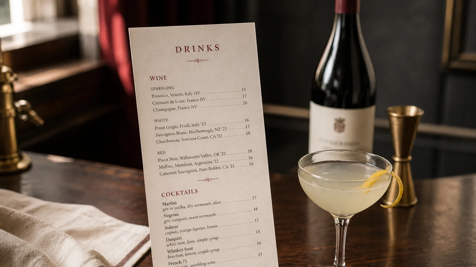
A food menu is mostly words. A drinks menu is mostly numbers: vintages, volumes, percentages, prices in two or three columns, and abbreviations the food menu never needs. That shift changes the typographic problem. A typeface that looks lovely on a dish description can fall apart when it has to align 40 prices and 40 vintages in a column, and small inconsistencies (12cl on one line, 12 cl on the next) show far more when they are repeated down a page. This is a working list of the rules that matter on a drinks menu, and how to check them before you print.
Choose the figures before you choose the typeface
Most quality typefaces ship with two figure widths and two figure heights. Proportional figures have varying widths, like letters; tabular figures all share one width, so columns of numbers align. Lining figures sit on the baseline at capital height; old-style figures have ascenders and descenders and sit like lowercase. A drinks menu needs tabular figures for every column of prices and vintages, and either style of height as long as it is consistent.
Check that your typeface actually has tabular figures (in most design tools they are an OpenType feature called tnum). Many free display fonts do not, and the result is a price column where 10 and 11 differ in width by the narrowness of the 1, so the column ripples. If your brand face lacks them, set the numbers in a companion face with tabular figures and keep the brand face for names and headings.
Units: cl, ml and the space before them
In continental Europe wine and spirits volumes are written in centilitres (12 cl, 4 cl, 75 cl) and beer often in centilitres or in fractions (25 cl, 50 cl, or a half and a pint in some markets). The UK and Ireland use millilitres (125 ml, 175 ml, 25 ml). Pick the convention of your market and use it for every line, including cocktails if you state their volume.
- Always a space between the number and the unit: 12 cl, not 12cl. Use a non-breaking space so the unit never falls onto the next line.
- Units are lower case and never take a plural s or a full stop: cl, ml, l.
- Percentages take a space before the sign in French, Italian and Spanish typographic conventions (12,5 % vol.) and no space in English (12.5% ABV). Follow the language of the menu.
- Decimal separators follow the language too: a comma in French, Italian and Spanish (12,5), a point in English (12.5). Never mix them on one card.
State units once wherever you can. A heading that says Wines by the glass, 12.5 cl removes a unit from every line below it; a column head that says Bottle and Glass removes a word from every price. The cleanest drinks menus have almost no units in the body at all.
Abbreviations that help and abbreviations that hurt
Some abbreviations are so standard that spelling them out looks odd: ABV or vol., cl, ml, NV for non-vintage on a Champagne list, DOCG or AOC after an appellation. Others save two characters and cost the guest a second of confusion: yo for years old, btl for bottle, gls for glass, Ch. for Château, Dom. for Domaine. On a printed menu with fixed width, the character saving is rarely worth it. Spell out bottle and glass in column heads, write years in full or just the number with a clear column, and write the producer's name the way it appears on the label.
Vintages are four digits, never two (2019, not 19), set in the same tabular figures as the prices and in their own column if the list is long. NV or a dash for non-vintage wines keeps the column aligned; leaving the cell empty looks like a mistake.
Capitalisation
Grape names are lower case in most style guides (chardonnay, nebbiolo), appellations and place names are capitalised (Chablis, Barolo, Rioja), and producers are as on the label. Cocktail names take an initial capital on the first word and on proper nouns (Negroni, Old fashioned, Tom Collins). Whatever you decide, decide it once and apply it to every line; inconsistency in capitals is the first thing a trained eye sees on a drinks list.
Columns, alignment and leaders
Prices align right, on the decimal if you use decimals. Vintages align right or centre in their own column. Names align left. That gives each line a stable left edge for reading and a stable right edge for scanning prices, and it makes dotted leaders unnecessary: the eye does not need help crossing a 40 mm gap when both edges are aligned. If the list has very long names and very short lines, tighten the column widths instead of adding leaders.
Keep the number of columns at two or three. Name plus price is the ideal; name plus glass plus bottle is the common maximum. A fourth column (half bottle, magnum, vintage) is better handled by splitting the list into sections than by squeezing the line.
Size, weight and leading for dense lists
Drinks menus run smaller than food menus because lines are shorter: 9.5 to 10.5 pt for the body, with leading at 1.3 to 1.4. Below 9 pt in a dim bar the numbers start to fail, especially old-style figures whose 3, 5 and 9 dip below the baseline. Use one weight for names, a lighter one or italic for descriptors, and regular for numbers; bold numbers in a price column look like a price list in a shop window.
Section spacing carries the structure: 5 to 6 mm between groups, 1.5 to 2 mm extra between lines that carry a descriptor, and a heading in small caps or a heavier weight at the same size as the body rather than a jump in size. On a 350 g A5 card this rhythm holds 25 to 30 lines a page and still reads as calm.
A ten-minute proof before you print
Print one copy at 100 percent. Run a ruler down each price column and check the right edge is dead straight. Search the file for cl and ml without a preceding space, for two-digit vintages, for yo and btl. Check that every percentage and every decimal uses the convention of the menu's language. Read every cocktail name for capital consistency. Ten minutes of this catches the mistakes that make a well-designed drinks list look careless.
In Menu Atelier, prices are set with tabular figures and aligned automatically in each design, units and decimal separators follow the menu's language, and you can proof the whole card in 3D at real scale before downloading the print bundle or ordering the printed menus.