Choosing restaurant brand colours that work on paper and on screen
A method for picking restaurant brand colours that print faithfully in CMYK, read on a phone and suit food: gamut traps, contrast, paper and a three-colour palette.
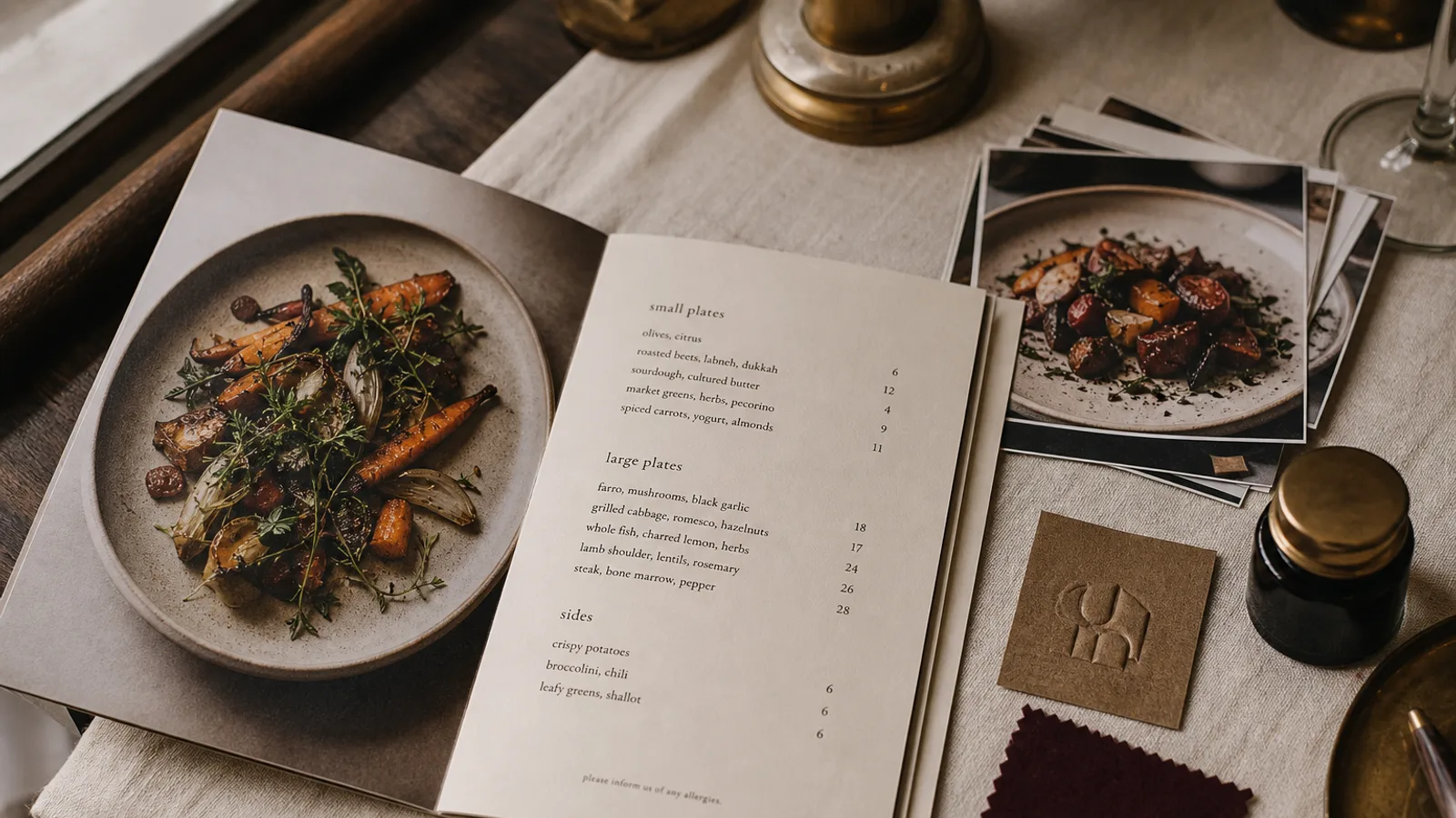
The colour you fall in love with on a laptop is not the colour that will come off the press. Screens emit light in RGB and can show colours that no printing ink can match; paper reflects light through CMYK inks and has a smaller, differently shaped range. Restaurants get caught in this gap constantly: a brilliant coral on the website turns salmon on the menu, a deep teal goes grey-green. This article walks through choosing colours that survive both worlds, that flatter food and that stay legible on a card under dim light.
Understand the gamut trap before you choose
Standard coated printing to Fogra39 or ISO Coated v2 cannot reproduce large parts of the sRGB screen space. The worst offenders are saturated oranges and reds with a lot of yellow, bright greens, vivid violets and electric blues. If your candidate colour is one of these, it will print duller no matter how good the printer is. The fix is not a better printer; it is choosing a colour that exists in both spaces.
The practical test is to view your colour in design software with CMYK soft-proofing turned on, or simply convert the file to Fogra39 and look at the difference. If the shift makes you wince, move the colour towards something less saturated or slightly darker until the screen and CMYK versions are close cousins. Better still, start from a printed swatch book under daylight and derive the screen values from the printed colour.
Colours and food: what the plate needs
A menu sits beside food, and some colours make food look worse. Blues and violets have almost no natural equivalent on a plate and can make warm dishes look cold by contrast; that is why they are rare in restaurant identities outside seafood and cocktail bars, where the association is with water and night. Warm neutrals, terracottas, olive and forest greens, ochres and deep reds sit comfortably next to food because they occur in it.
This does not mean avoiding cool colours. A dark navy or a slate green makes an excellent cover or accent precisely because it recedes and lets the warm tones of the room and the plates come forward. Use cool colours as containers and warm colours as content.
Build a three-colour palette
- A base: a near-neutral that covers most of the menu surface, usually a warm or cool off-white, or a very dark shade for evening venues. Choose it from the paper you intend to print on; unprinted paper is a colour too.
- A primary: the colour people will name when they describe you. This goes on the cover, the sign and the website header. It must exist in CMYK without a painful shift.
- An accent: a small-dose colour for section headings, a highlighted dish or a rule under the name. It should contrast clearly with both the base and the primary; it is the only place where a slightly brighter colour is acceptable because it covers so little area.
Write each of the three down as CMYK, Pantone and hex, checked against a printed proof. Resist the fourth colour. Every additional colour halves the chance that all your printed material matches.
Contrast is not optional
Whatever colours you love, body text on a menu needs a contrast ratio of at least 7:1 against its background to be read comfortably by a 60-year-old under 100 lux of restaurant light. Black or very dark grey on off-white achieves this easily. Dark green on cream works. Mid-grey on white does not, and neither does any colour of text on a mid-tone background. Reserve coloured text for headings at 14 pt or above, and keep dish names, descriptions and prices in your darkest ink.
White text on a dark background reads on screen but is harder on paper: the ink spreads slightly into the paper fibres and the thin strokes of the letters close up. If you want a dark menu, use a typeface with sturdy strokes at 11 pt or more, and print on a coated board where the ink stays on the surface.
Paper changes the colour
The same CMYK values printed on a bright white coated board, a natural white uncoated board and a cream stock give three visibly different colours. Uncoated paper absorbs ink and lowers saturation and contrast by a noticeable margin; cream paper warms every colour on top of it, which flatters reds and browns and muddies blues. Decide the paper before finalising the palette, and ask for a proof on the actual stock. A soft-touch laminate also deepens dark colours slightly and gives blacks a velvety quality that suits evening venues.
Test in the room, not the studio
- Print your three colours as solid blocks on the intended paper and take them to the restaurant at 8 pm. Warm 2700 K bulbs shift everything towards orange; a colour balanced for daylight may look brown.
- Hold the swatches against the wall, the table and a white plate. The primary should sit comfortably with all three.
- Photograph the swatches with a phone under the room light. If the photo looks nothing like the swatches, guests posting pictures of your menu will be showing the wrong brand.
- Check the website on a phone at half brightness outdoors. The primary should still be recognisably the same colour as the printed menu.
Locking the palette so it stops drifting
Once the three colours pass the proof, the room test and the phone test, write them into a one-page sheet and treat them as fixed. Every future menu, flyer and sign is matched to that sheet rather than to a previous printout, which is how drift creeps in. In Menu Atelier you set your palette once from your logo and brand photos, the AI applies it consistently across every style and format you try, and the print bundle exports with your CMYK values embedded so the menu that arrives from the press matches the one you approved in the 3D preview.