Scandinavian menu design: clarity, air and honest materials
What makes a menu read as Scandinavian: a strict grid, one sans serif, lots of air, muted colour, uncoated paper and no ornament, with sizes and margins.
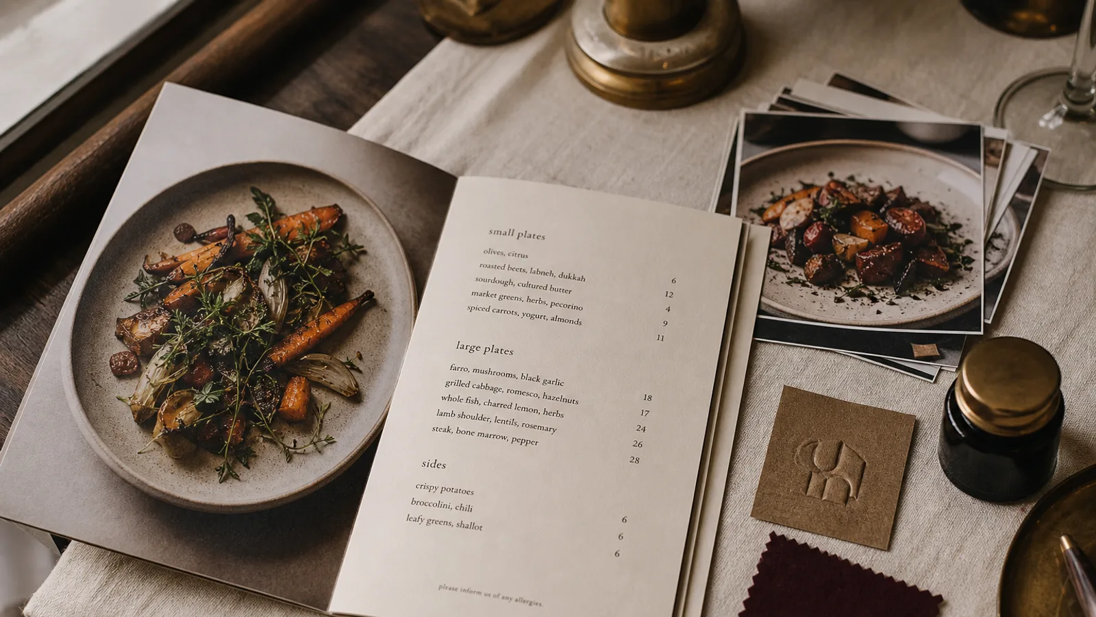
A Scandinavian-looking menu is the easiest style to describe and one of the hardest to execute, because it depends on nothing being wrong. There is no ornament to hide behind, no texture to add warmth, no colour to distract from a badly spaced line. What remains is a grid, a typeface, the paper and the words, and each of those has to be chosen with some precision. This article sets out the rules as a prepress operator would: sizes, margins, weights and stocks, with the reasoning behind each.
A grid you can feel but not see
Nordic graphic design inherited the Swiss grid and softened it. On a menu, that means a strict modular structure underneath: a baseline grid of 4 or 4.5 mm, columns that align to it, and every element, from the restaurant name to the allergen key, sitting on a grid line. The guest never sees the grid; they feel the calm it produces.
For an A4 sheet, use outer margins of 18 to 22 mm and an inner text block of two columns with a 10 mm gutter, or a single column of about 110 mm for a short list. For an A5 bifold, margins of 14 to 16 mm and a single column per panel. Align dish names left and prices right on the same baseline, with no dotted leaders; the empty space between them is part of the design.
One typeface, two or three weights
The style is carried by a single sans serif family, usually a grotesque or a neo-grotesque with open counters and even stroke weight. Use a regular weight for dish names and descriptions at 10 to 11 pt with a leading of 14 to 15 pt, a medium or semibold for section titles at the same size or one point larger, and a light weight for the descriptions if the family has one and it stays legible on your paper. The restaurant name can be set in the same family at 18 to 24 pt, never in a different font.
- No italics for descriptions; use a lighter weight or a slightly smaller size instead.
- Section titles in lower case or sentence case, not capitals; the look is quiet, not announced.
- Lining numerals for prices, tabular if the font has them, so the columns align.
- Letterspacing at default for body, opened by 3 to 5 % only for section titles in small sizes.
Air is not empty
The Scandinavian card is roughly 60 % unprinted. Between sections, leave at least three baseline units; between dishes, one. A description should be one line or at most two; if it runs longer, cut words rather than shrinking type. If the dish list does not fit in the format with these spacings, use a larger format or a second face rather than tightening. The most common failure is a well-chosen typeface set with the margins of a supermarket flyer.
Colour: almost none, and muted
Type is black or a very dark warm grey, around 90 % black with a little yellow and magenta to soften it, on off-white paper. If you introduce a colour, it is one: a dusty blue-grey, a sage, a pale clay or an ochre, used for section titles or a single rule, at a saturation that would look drab as a wall paint. This colour should exist comfortably inside the Fogra39 gamut; the palette is chosen partly because it prints perfectly on uncoated stock without any surprise.
No colour blocks, no coloured backgrounds, no reversed-out white type. The paper is the colour.
Honest materials: paper you can feel
The style is often described as material honesty, and on a menu the material is the board. Choose an uncoated stock with a natural, slightly warm white and a smooth or very lightly textured surface, 300 to 350 g. Recycled boards with a visible fleck are on-brand for a café, less so for a restaurant with a tasting menu. Avoid any lamination that adds a plastic sheen; if you need protection, a soft-touch matte finish is the only one that preserves the paper feel.
Because uncoated paper absorbs ink and reduces contrast, this is a style where the dark warm grey has to be truly dark, and light weights of the typeface should be tested on a proof from the actual stock before committing. A light weight that looks elegant on screen can turn to a faint grey whisper on a fibrous board.
What you leave out
- Rules and frames, unless one hairline separates the header from the list.
- Icons for dietary information; use small text codes in the same typeface and a one-line key instead.
- Photographs, unless a single full-bleed image on a cover, in natural light, with no styling.
- Ornaments, flourishes, logos with more than one colour, and any typeface other than the one you chose.
- Sales language; a Scandinavian menu describes and does not persuade. « Cod, brown butter, dill » is a complete description.
Format and how the card is handed over
The style suits a single A4 or A5 sheet, printed on one side, more than a bifold; the fold itself is a kind of ornament. For a longer offer, two separate sheets, food and drink, are more in keeping than one folded card. Square corners, no rounding. The card should be handed over flat, not in a holder or a clip; the object is the sheet.
Discipline as the whole style
Everything here reduces to a grid you respect, a typeface you trust, paper you can feel and the willingness to leave half the sheet empty. Get those four right and the menu will look considered from across the room and read effortlessly at the table. In Menu Atelier the Modern Minimal style follows this grammar, with a baseline grid, a single sans serif and generous margins built in, and the 3D preview lets you judge how a light weight reads on an uncoated natural-white board before you download the print files or order the run.