Mediterranean menu design: blue, terracotta and sun-bleached white
How to design a Mediterranean menu that feels like a coastal kitchen rather than a travel brochure: a three-colour palette that prints, warm paper and tile-based ornament.
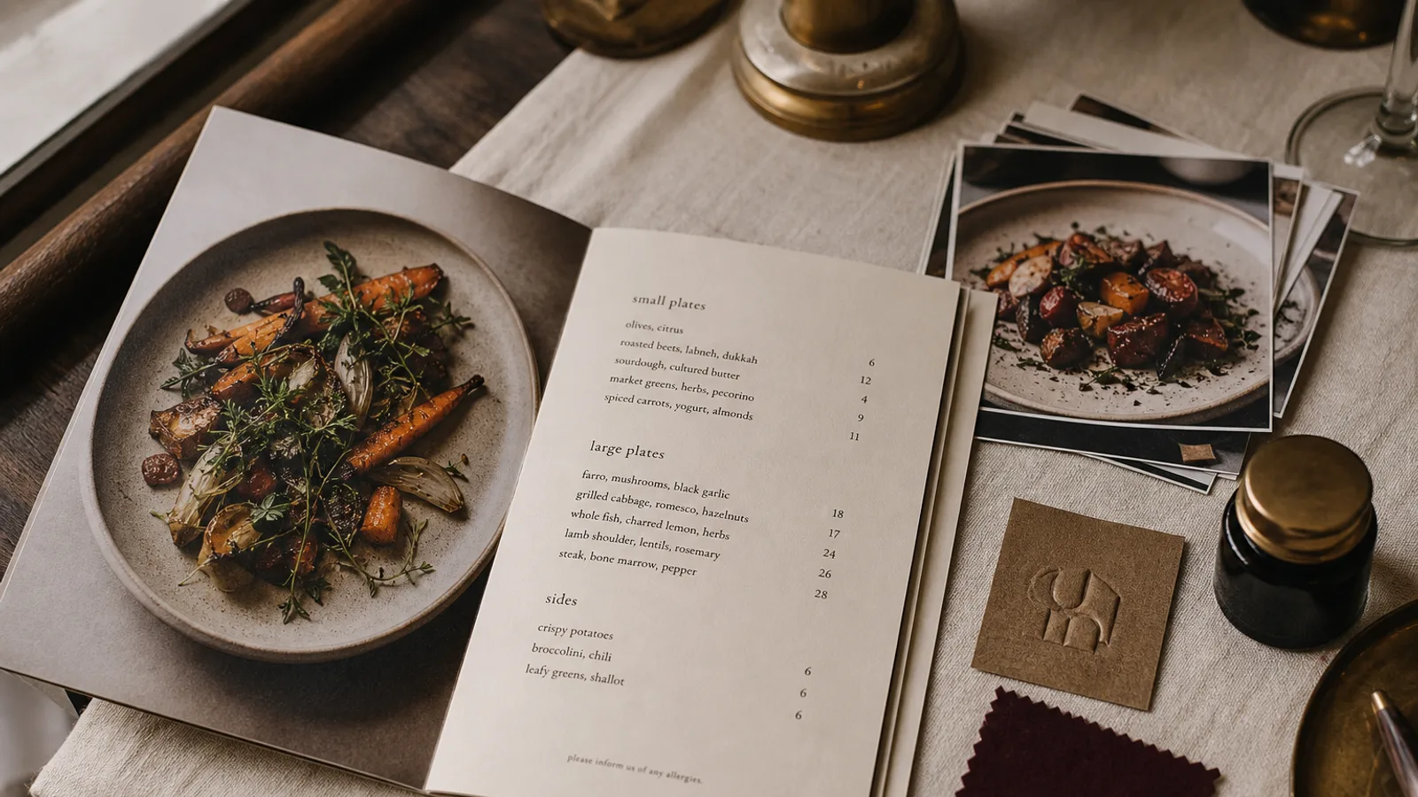
The Mediterranean is the most over-illustrated cuisine in Europe. Olive branches, lemons, fishing boats and whitewashed domes appear on so many menus that they have stopped meaning anything. And yet the visual language of the coast, from Marseille to Naples to the Cyclades to Valencia, is genuinely rich and can produce a card that feels like sun on a stone terrace. The difference lies in taking the palette, the materials and the geometry from real places and leaving the clip art behind. Here is how to build that card and get it to print the way it looks on screen.
The palette: three colours from the landscape
The Mediterranean palette is not turquoise and hot orange. Look at a photograph of a real coastal village at four in the afternoon: the whites are warm and slightly grey, the blues are deep and dusty rather than electric, and the earth tones are the red-brown of fired clay, not tangerine. Build your three colours from that.
- A sun-bleached white as the base: not paper white but a warm off-white, roughly 3 % cyan, 3 % magenta, 8 % yellow, 0 % black, or better still an uncoated natural-white board that has this tone without printing.
- A deep sea or shutter blue as the primary: around 90 % cyan, 60 % magenta, 10 % yellow, 20 % black. It prints reliably and reads as blue rather than purple under warm light.
- A terracotta as the accent: around 20 % cyan, 70 % magenta, 85 % yellow, 15 % black. Use it for section titles, a rule under the name, or a single highlighted dish.
Both the blue and the terracotta sit comfortably inside the Fogra39 gamut, which is why this palette is forgiving to print. The trap is pushing either one brighter to look good on screen; the print will lose that brightness and land on mustard and violet.
Paper: warm, uncoated and slightly heavy
This style depends on the paper looking like plaster or linen rather than plastic. Choose an uncoated board in natural or cream white, 300 to 350 g, with a smooth or lightly textured surface. Coated stock and any gloss finish work against the mood immediately; a soft-touch matte laminate is the only acceptable protection if the card must survive sea air and sunscreen fingers on a terrace.
Because uncoated paper absorbs ink, print the blue and terracotta as flat solids rather than tints; a 40 % tint of blue on uncoated stock goes patchy and grey. Keep large solid areas to the cover only, and let the inside pages be mostly paper with small amounts of colour.
Ornament: tiles, not lemons
Every Mediterranean culture has a tile tradition: Portuguese azulejos, Andalusian zellige-influenced patterns, Neapolitan riggiole, the geometric borders of Greek island churches. These give you a legitimate source of ornament that is geometric, repeatable and recognisably regional without being a cartoon. Use a single tile motif as a border strip along one edge of the cover, 10 to 15 mm deep, in blue on white or white on blue, and nowhere else.
If you want a figurative element, one hand-drawn line illustration in a single colour does more than a dozen icons: a sardine, a branch of thyme, the outline of the harbour front. Commission it or draw it yourself, keep it under 40 mm, and place it once. Never a photo of a sunset, never a stock illustration of an olive.
Typography with warmth
Mediterranean signage is hand-painted, so a card that echoes it should have some human irregularity in the display type: a slightly condensed humanist serif or a hand-lettered restaurant name, in the shutter blue, at 24 to 36 pt. Body text stays disciplined: a legible book serif or humanist sans at 10 to 10.5 pt, in a very dark blue or near-black, never in the accent colour. Prices align right; a dotted leader in this context is acceptable and even fitting, because it echoes the market chalkboard.
Section names in the local language give texture: « Meze », « Antipasti », « Tapas », « Petits plats » can sit above the translation in small caps. Do this only for languages you actually cook; a Greek word on a French menu that serves no Greek food is decoration, not information.
Structure for shared plates and long lunches
Mediterranean menus are usually built around sharing and around seasonal fish, which has two layout consequences. First, sections should be organised by how the table eats, small plates then larger plates then grilled fish and meat, rather than by the French starter-main-dessert sequence. Second, the fish section needs a « market price » or « per 100 g » convention that is clear and honest: state the unit, and if a price is variable, print « selon arrivage » or the local equivalent rather than leaving a blank. Under EU rules the 14 allergens still apply to every shared plate, so build the key in from the start.
Format for terraces and wind
- A single A4 or A5 sheet on 350 g board blows away; a bifold with the fold at the top or a card in a simple wooden holder stays put.
- Single-sided printing keeps the reverse free for a chalk-style daily fish list, either hand-written in a blank box or printed as a separate insert.
- Round the corners at 3 mm if the card lives outdoors; square corners on heavy board fray within a fortnight.
- Order a smaller quantity more often; sun fades terracotta and blue noticeably over one summer season.
Getting the coast onto the card
The card that works takes three colours from the real landscape, prints them flat on warm uncoated paper, borrows a tile border rather than a lemon, and keeps the type warm but disciplined. It should look at home next to a carafe of rosé and a dish of olives, and it should still be legible when the sun is directly overhead. In Menu Atelier the Mediterranean style starts from this palette and tile-strip grammar, and you can see how the blue and terracotta sit on a natural-white board in the 3D preview before choosing between a single sheet for the terrace and an A5 bifold for the dining room.