Consistent branding across menu, signage and website
Why the same colour looks different on a vinyl sign, a printed menu and a phone screen, and a practical method to keep type, colour and voice aligned across all three.
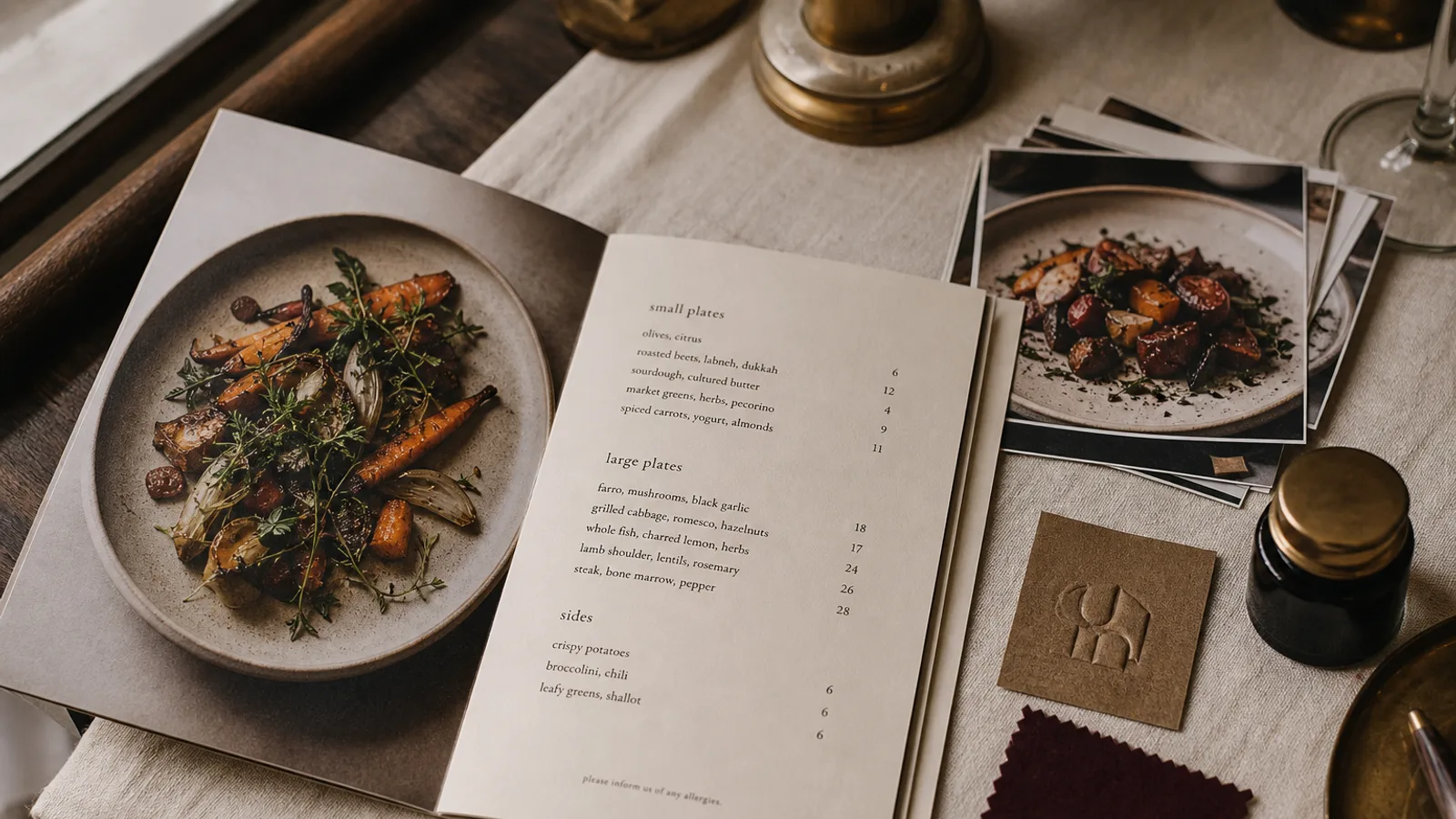
The guest sees your sign from the street, checks your website on their phone at the door, and opens the menu at the table, all within three minutes. If the green on the awning is olive, the green on the website is lime and the green on the menu is forest, they have met three restaurants. Consistency across these three surfaces is not about a logo appearing in the same place; it is about the same decisions surviving three very different production processes. This article explains why they drift and how to stop it.
Why the same colour comes out three ways
A sign maker cuts vinyl from a catalogue of a few hundred stock colours, or prints on a wide-format machine with its own inks. A menu is printed in CMYK on a specific board, most often to a Fogra39 or ISO Coated v2 standard. A website shows sRGB light on a screen whose brightness the guest controls. None of these can reproduce the others exactly; the job is to choose a colour that lands close in all three and to specify it separately for each.
Start from print, because it has the smallest gamut. Pick your brand colours from a printed swatch book under daylight, then derive the screen and vinyl versions from that. If you start from a screen colour, especially a saturated orange, teal or violet, the printed menu will always look like a dull cousin of the website.
One specification, four values per colour
For each brand colour, record four values and give the right one to the right supplier:
- CMYK percentages for the menu and any offset or digital print, checked on a proof from the actual board you will use.
- A Pantone solid reference for sign makers, embroiderers and anyone mixing paint; ask them to match to it, not to a printout.
- A hex or sRGB value for the website and social media, adjusted by eye on a calibrated screen so it looks like the printed swatch, not like the CMYK numbers converted mechanically.
- A named vinyl or RAL reference if you have an existing sign or painted facade, so that new elements match what is already there rather than the theoretical brand colour.
Keep these on one sheet. The menu printer should never be guessing from a photo of your shopfront, and the sign maker should never be matching to a screenshot.
Typography: the same voice at 8 mm and 800 mm
A typeface that works at 10 pt on a menu does not automatically work at 300 mm on a fascia. Thin hairlines vanish at small sizes and look fragile at large ones; a very heavy display face fills in on the menu and dominates the street. The practical answer is a family with several weights: a medium or semibold for the sign, a regular for the menu body, a bold for section headings, all recognisably the same design.
For the website, licence the web version of the same family or choose a close free equivalent and record the pairing. A restaurant name set in a serif on the sign, a geometric sans on the site and a script on the menu is the most common inconsistency I see, and it is usually because three different people did the three jobs a year apart.
Voice: the sentence test
Consistency of tone is easier to check than colour. Take one sentence from the website, one from the sign or window vinyl and one dish description from the menu, and read them aloud in a row. If they could have been written by the same person on the same afternoon, the brand holds. If the website says « an unforgettable culinary journey » and the menu says « chips, the proper kind », one of them is lying.
The menu is usually the most honest of the three, because it is written by whoever cooks. Rewrite the website and signage towards the menu, not the other way round.
Order of operations when something changes
- Change the menu first. It is the cheapest to reprint and the most closely read; if the new colour or type fails here, it fails everywhere.
- Update the website the same week; a new menu with old website branding confuses the guest who checks before booking.
- Update the digital menu or QR landing page at the same time, using the exported PNG faces so the online version is the same artwork as the printed one.
- Change signage last and only when the budget allows; in the meantime make sure the menu and website at least match each other.
A quarterly walk-through
Once a quarter, stand outside with a printed menu in your hand and your website open on your phone. Look at the three together in daylight. Photograph them side by side and keep the photo; comparing this quarter's picture with last year's makes drift visible in a way that memory does not. Check the small things that are most often wrong: the phone number, the opening hours, the spelling of a dish, the version of the logo.
Building the chain from the menu outward
If the menu carries the exact CMYK values, the exact typeface and the real voice of the kitchen, the sign and the website have a fixed reference to match, and consistency becomes a matter of copying rather than judging. In Menu Atelier the palette and fonts you set once travel with every export, so the print PDF for the table, the PNG faces you put on your website and the A5 version for the window all come from the same source and stay in step when the menu changes.