Describing wine on a menu: notes that help rather than intimidate
How to write wine descriptions for a restaurant list guests actually use: the six facts every line needs, a 12-word note format, what to leave out and how to lay out the list.
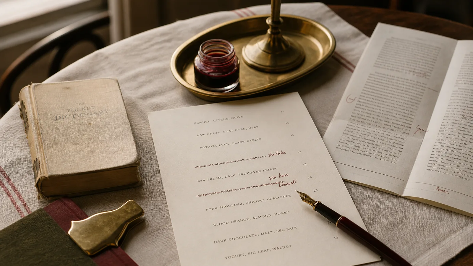
Most wine lists fail in one of two directions. The bare list gives a name, a vintage and a price and leaves the guest to bluff or ask; the annotated list describes each bottle in the vocabulary of a trade tasting ("brooding tertiary notes, saline finish, tension") and leaves the guest feeling tested. Neither helps someone choose a bottle for four people who ordered fish, lamb and a risotto. Good wine copy sits between the two: a fixed set of facts on every line and, where you want it, a note of about a dozen plain words that says what the wine is like to drink.
The six facts every line needs
Before any tasting note, a wine line has to carry the information that lets a guest orient herself. Set these in the same order on every line and most of the intimidation disappears, because the list becomes scannable.
- Colour or type, as a section heading rather than repeated per line: white, red, rosé, sparkling, sweet, orange if you have them.
- Region and appellation, in the form the label uses: Chablis, Rioja Alta, Etna Rosso, Vinho Verde. This is the fact most guests navigate by.
- Grape variety, unless the appellation implies it so strongly that repeating it is noise (nobody needs Sangiovese after Chianti Classico). For blends, the two main grapes.
- Producer, because two Chablis at the same price are different wines, and because a guest who liked it wants to find it again.
- Vintage, or NV for non-vintage sparkling. A list without vintages reads as a list that does not want to be checked.
- Price, and the serving size it applies to: 12 cl glass, 50 cl carafe, 75 cl bottle. If you serve more than one size, put the sizes in the column header, not on each line.
That is a lot for one line, which is why the wine list is the one place where a two-line entry is standard: producer and wine name on the first, region, grape and vintage on the second in a smaller size, price aligned right on the first line. Keep the type at 9 pt minimum; wine lists are read in the dimmest corner of the room, often by the oldest person at the table.
The 12-word note
A tasting note on a menu is not a review. It has one job: to tell a guest who does not know the wine what it will feel like in the mouth and what it goes with. Twelve words is about right; twenty is the maximum. The format that works is body, then two or three flavour cues, then a pairing or an occasion.
- Light, crisp, green apple and lime; the one for oysters and the first glass.
- Medium-bodied, red cherry and dried herbs, soft tannin; drinks well with the lamb.
- Full and textured, ripe pear, a touch of oak; for the risotto or the roast chicken.
- Dry, delicate bubbles, brioche and citrus; from the aperitif to the end of the starters.
Notice what these do. They use words a guest has eaten: apple, cherry, pear, herbs, brioche. They give body first, because body is what most guests actually mean when they say they want "something lighter". They end with the table, not the cellar. And they avoid the trade vocabulary that makes a guest feel examined: minerality, tension, tertiary, austere, linear, saline are precise words to a sommelier and noise to almost everyone else.
What to leave out
Scores and medals. A 92-point rating tells the guest nothing about whether she will like the wine, and it turns the list into a competition. Winemaking detail beyond one word: "unoaked" or "skin contact" earns its place, "18 months in 30 percent new French barriques" does not. Adjectives that judge rather than describe: elegant, beautiful, stunning, complex. Every wine on your list is presumably good; saying so on each line is redundant.
Leave out, too, the biography of the winemaker on the dish list. If you want to tell the story of a grower you love, give it a short box on the back page, in the same place your producers appear for the food. One paragraph there does more than a sentence on every line.
Structure: by colour, by weight, or by price?
The default structure, colour then region, is fine for a list of 20 to 60 references and is what most guests expect. Two alternatives suit particular rooms. Ordering by weight within each colour (lightest to fullest) helps enormously when your guests are choosing to match food, and it lets you drop the body word from every note. Ordering by price within each section is what guests do anyway with their eyes; putting the list in that order removes the search but can make the list feel like a price tag.
Whatever the order, keep the by-the-glass selection as its own section at the front, with a note per wine, since those are the wines most guests will actually choose from. On a menu that includes food, the glass selection can sit on the food card next to the dishes; the full bottle list is a separate document.
Layout and the price column
Wine prices are read more critically than food prices, so alignment matters. Right-align them on a shared column; do not use dotted leaders on a wine list, because the two-line entries make the dots wander. Set the currency once at the head of the column, not on every line. If you list glass and bottle prices, two aligned columns with headings (12 cl, 75 cl) are cleaner than "7 / 34" strings that force the guest to work out which is which.
Typographically, producer names in small caps or medium weight, wine names in regular, the technical second line in italic at 8 pt, the note in regular at 8.5 pt. That gives three visual levels without any change of typeface, and the note stays visibly optional.
Finally, the list must be true tonight. Nothing undermines wine copy faster than "we are out of that one" on three bottles. Print the bottle list in small runs, or print the by-the-glass selection on a card that is easy to replace, and reprint the moment a vintage changes; the vintage on the card should be the vintage in the glass.
A list a guest can use without asking
The test of good wine copy is whether a guest with no wine vocabulary can pick a bottle for her table in under a minute and be pleased with it. Six facts in a fixed order, a twelve-word note in kitchen words, sections that reflect how people actually choose, and prices that line up: that is a list that sells wine by making it easy, not by making it sound expensive.
In Menu Atelier, drinks and wines are entered with their own fields (producer, region, grape, vintage, glass and bottle prices) and laid out on a two-line entry with aligned price columns in the typography of your chosen style; the Art Deco Cocktail and Fine Dining Editorial styles include a dedicated wine list layout, and reprinting after a vintage change is a matter of editing one field and exporting again.