Digital menu screens: designing for a screen that never stops
How to design restaurant menu screens that stay readable in a queue: type sizes, dwell time, motion, contrast, and what never to animate.
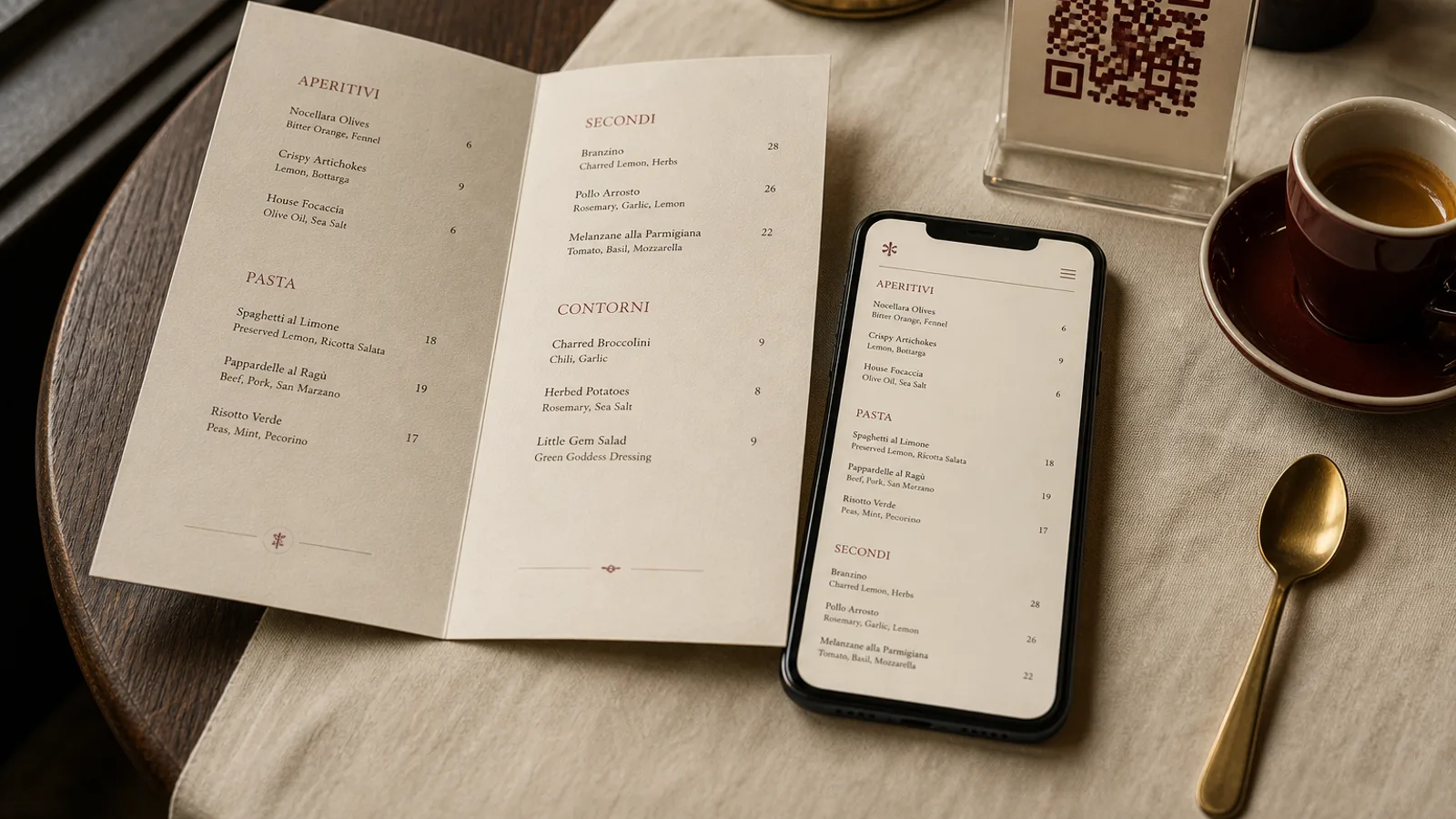
A menu on a screen has no last page and no paper grain. It can change at noon, flash a sold-out line, and fail at 13:10 when the player reboots. Designing for that surface is not the same as cropping a printed card to 16:9. The guest is standing, often in a queue, often with sun on the glass. They have eight to twenty seconds before the person behind them moves up. Everything on the screen has to survive that interval.
Type that holds at three metres
Start from the farthest guest who must decide, not from the designer’s laptop. At three metres, dish names need to sit around 28 to 40 pt equivalent on a typical 43- or 55-inch panel; prices a step smaller, never half the size. Headings can go larger. Descriptions, if you keep them, are one short clause. Grey type, thin sans, and 8 pt leftovers from a print file disappear. If you cannot read the line from the door with one eye closed, it is not on the screen.
Contrast beats decoration. Light text on a dark field holds in a bright room better than black on a photographed plate. A busy background image behind the list is the most common failure: the type fights the carbonara. Put photography in a band, or drop it. The list is the product.
Dwell time, not cinema
If the screen rotates through pages, each page must stay long enough for a new arrival to finish it. Twenty seconds is a minimum for a 15-line food page; thirty is kinder. A loop that flips every eight seconds trains guests to wait for “their” page and blocks the queue. Better: one page for food, one for drinks, both visible if you have two screens. One screen, one list, updated, beats a slideshow of everything you wish you could show.
Motion has two honest jobs: a sold-out strike-through, and a single line that says today’s special. Ken Burns pans, bouncing prices, and logo stings waste the seconds the guest has. Anything that moves while the guest is reading a price will be reread. Anything that autoplays sound in a dining room will be turned off by the first waiter who can reach the remote.
What the screen must still declare
A digital board is still a menu under Regulation 1169/2011. Allergens have to be available before the order, in a form the guest can use. A tiny “ask staff” in the corner is weak if the queue is loud. Put numbers on the lines and a readable key on the same screen, or a short printed legend at the counter. Prices include tax where the law requires it. If a cover or tray charge exists, it belongs on the screen, not on the receipt.
- One column of dishes; two columns only if both remain above 28 pt.
- No carousel of hero photos in the same frame as the list.
- A paper fallback within arm’s reach of the till for when the player dies.
- The same names and prices as the handheld card, if you also have one.
Hardware is part of the layout
Mount the panel where the queue already looks, not where the HDMI cable reached. Avoid a window that washes the screen at 12:30. Brightness that looks fine at install is often too dim at lunch and too harsh at dinner; give the staff a day and night preset, not a buried service menu. Bezel and mounting should not eat the last line of prices. A screen hung too high turns the menu into ceiling art that nobody reads without lifting their chin.
A list that holds still long enough
Design the screen as a board that can change, not as a video that happens to contain prices. Large type, high contrast, long dwell, almost no motion, legal mentions on the same face, and a paper plan for failure. If the player dies at 13:10, the paper list at the till is the menu for that service, not a promise to reboot. The rooms that do this stop using the waiter as a backup display. The rooms that do not spend the lunch rush pointing at a rectangle nobody can finish.
In Menu Atelier you set the dish list once and can export a face as a high-resolution PNG for a static screen, or keep the same names on a printed A5 card for the tables; switch format in one click rather than rebuilding the offer for each surface.