Spirits list design: whisky, rum and gin without the alphabet soup
How to organise a spirits list so guests can navigate 40 bottles of whisky, rum and gin: grouping logic, what to write on each line, pour sizes, price columns and type.
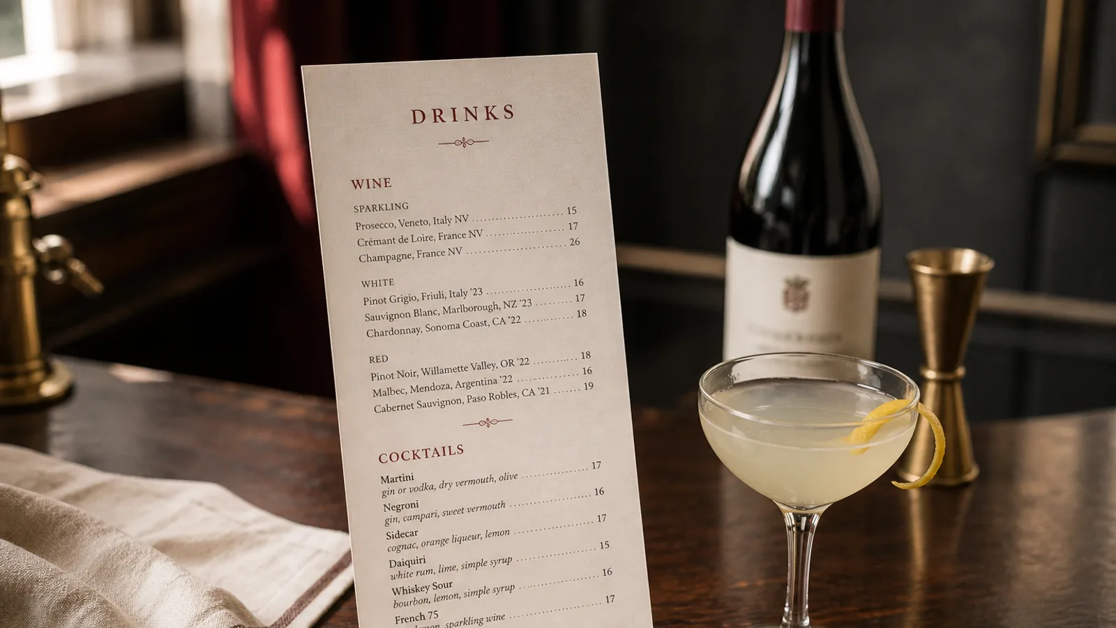
Hand a guest a list of 60 spirits in alphabetical order and you have handed them a phone book. They will order the one name they recognise, usually the cheapest, and the 40 € pour of 18-year-old single malt you are proud of will sit on the shelf. A spirits list is a map, not an inventory, and the design job is to give the guest a route through it. This article covers the grouping logic for whisky, rum and gin, what each line should say, how to present pour sizes and prices, and the typography that keeps 60 lines legible on two A5 pages.
Group by what the guest already knows
Guests arrive with a rough mental model: whisky is Scottish, Irish, American or Japanese; rum is light or dark; gin is London Dry or something newer. Build the first level of your hierarchy on that model, not on the distributor's categories. Within whisky, group by country and then by region or style (Islay, Speyside, Highlands; bourbon, rye). Within rum, group by style (light and white, aged, spiced, agricole and cachaça) rather than by island, which most guests cannot place. Within gin, group by London Dry, contemporary and flavoured, or by botanical family (juniper-forward, citrus, floral, herbal) if your bartender can talk that way.
Inside each group, order by price ascending. It is honest, it is what the guest expects, and it makes the premium bottles at the bottom of each block look like the natural destination of the list rather than a trap.
What to write on each line
A spirits line has four elements, in this order: producer or brand, expression (age statement, cask finish, edition), origin, and a two- or three-word style note. Cask strength or unusual ABV is worth stating; standard 40 percent is not. Age statements go as a number and the word years, not as 18y or 18yo, which reads as stock code.
- Whisky: distillery, age or expression, region; a note such as peated, sherried, light and grassy
- Rum: producer, age or style, country; a note such as molasses and vanilla, grassy agricole, funky pot still
- Gin: producer, style, country; a note listing two or three signature botanicals
- Everywhere: no tasting-note paragraphs; the guest is standing at a bar or ending a meal and wants to choose in ten seconds
Resist listing the full range from a single brand. Six expressions from one distillery read as a sponsorship. Two or three well-chosen ones read as curation, and they give the server something to say.
Pour sizes and the price column
Spirits pours vary by country: 4 cl in most of France, Italy and Spain, 25 ml or 35 ml in the UK and Ireland, 2 cl for a small measure in parts of central Europe. Print the standard pour once, under the section heading (Spirits served in 4 cl; 2 cl measures available on request), and never on each line. If you offer two sizes, use two aligned price columns headed with the volumes.
Price the pour on a per-bottle logic: bottle cost divided by pours, times a factor of 3 to 4 for standard spirits, 2.5 to 3 for premium ones where the absolute margin is already large. A 70 cl bottle bought at 35 € gives 17 pours of 4 cl at about 2 € cost, which supports a 7 € to 8 € list price; a 200 € bottle supports 30 € to 35 € a pour, not 50 €. Show prices in whole or half euros with tabular figures so the column aligns.
The mixer question
If a gin is mostly going into a gin and tonic, say so once: Gin and tonic with any gin below, plus 3 €, with the house tonic named. That removes a whole column of G&T prices and lets the gin list read as a gin list. For whisky and rum, offer a single line about serving (neat, with water, over ice) and leave cocktails to the cocktail menu.
Typography for 60 lines
A spirits list is dense by nature and the design has to keep it breathing. Use a body size of 9.5 to 10 pt, which is smaller than a food menu but justified by the short line length. Set the brand in medium weight or small caps, the expression and origin in regular, and the style note in italic or a muted grey. Leading of 1.3 times the body size, with 5 to 6 mm between groups and a group heading in the same size as the body but in small caps or a heavier weight.
Two columns per A5 page is possible if the lines are short; on A4 it is the natural choice. Do not use dotted leaders between name and price; the lines are short enough. Old-style figures suit a whisky list in a serif face; tabular lining figures suit a modern gin list in a sans. Pick one and use it for the whole drinks menu.
Flags, icons and other shortcuts to avoid
Country flags next to whiskies look like an airport shop. Little pictograms of casks and stills add noise without information. A map of Scotland with distilleries marked is charming once and useless the second time the guest looks for a bottle. The one visual device that earns its place is a small marker for a limited or featured bottle, used on at most three lines, with a one-word key.
If your list is long enough to need navigation, a short index at the top of the page (Whisky p. 2, Rum p. 3, Gin p. 4) is more helpful than any icon.
A list the bartender can hand over with confidence
Group by what the guest knows, order by price within the group, write four elements per line, print the pour once, use tabular figures, and let the type do the work. A list built this way lets a guest with no whisky knowledge find a peated Islay at 9 € in ten seconds and lets a connoisseur find the 18-year-old at 32 € in five.
In Menu Atelier, spirits sections are ordinary menu sections with a secondary line for the style note, so the grouping and two-column layout described here can be built directly, previewed in 3D on an A5 bifold and exported print-ready or ordered printed on 350 g board.