Food photos on menus: when they help and when they cheapen
A designer's rules for using food photography on a printed menu: which venues benefit, how many photos to print, sizing, paper and the signs a photo is hurting your ticket.
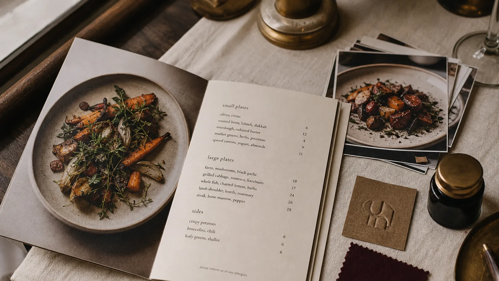
A photo on a menu is the loudest element on the page. It pulls the eye before any headline, before any price, before the dish you actually want to sell. Used well, it raises the perceived value of a dish and shortens the decision. Used badly, it drags the whole card down to the level of a motorway service station. This article gives you a working rule for deciding, venue by venue, whether to print photos at all, how many, at what size and on which paper, and how to spot when a photo is costing you money.
What a photo actually does to a guest
Guests read a menu in a few seconds of scanning followed by a slower second pass. A photo interrupts the scan and anchors it. Cornell's menu research on attention and item placement points in the same direction: whatever gets the eye first sets the reference for everything else. If the photo shows your 24 € sea bass, the 18 € pasta next to it suddenly looks reasonable.
The flip side is that a photo makes a promise. The plate that arrives will be compared to the picture, and any gap between the two reads as a small betrayal. A dish photographed under studio light with a garnish you never actually use will lose you more goodwill than a plain line of text ever could.
Venues where photos earn their place
Photos work when the guest does not already know what the dish looks like, or when the format of the venue is fast and casual enough that a picture replaces a conversation with a server. In practice that means:
- Fast-casual and counter-service places where guests order in under a minute and there is nobody to describe the food.
- Cuisines that are unfamiliar to most of your local clientele: a ramen bar in a provincial town, a Georgian restaurant, a Filipino café.
- Tourist-heavy locations where a third of the room does not read the menu language fluently.
- Dessert and pastry cards, where the visual is the argument and the ticket is small.
- Kids' menus, where the reader may not be reading at all.
In all of these cases the photo does a job text cannot do. It is not decoration; it is information.
Venues where photos cheapen the card
A fine-dining room, a serious bistro, a wine bar with a short plate list, a trattoria that has served the same twelve dishes for thirty years: none of these need photos, and most are actively hurt by them. The guest already expects a certain level and the printed photo signals the opposite. In these rooms the menu is a document, not a catalogue, and the language of the document is type, paper and white space.
There is a middle ground. A single, large, deliberately composed image on the cover of a bifold, or one atmospheric brand photo on the back, can carry warmth without turning the inside into a picture book. The rule I give owners is simple: a photo of the room, the bread oven or the hands of the chef is branding; a photo of the plate is a sales argument. Choose which one you are doing.
How many, and how big
The most common mistake is printing a thumbnail next to every line. Forty small pictures cancel each other out and force the type down to 8 pt to make room. Attention is a fixed budget; spend it on the dishes with the best margin.
- Pick two to four dishes per page at most, ideally the ones with a gross margin above 70 %.
- Print each at a minimum of 45 × 45 mm on A4 and 35 × 35 mm on A5. Anything smaller turns into a coloured smudge under restaurant lighting.
- Keep a consistent crop and angle across all photos on the card: all top-down, or all at 45 degrees, never a mix.
- Leave at least 6 mm of clear space between a photo and the nearest block of text so the two do not fight.
- Never place a photo directly beside a price column; the eye will jump from picture to number and skip the description.
A single hero image at 120 mm wide on a bifold panel will sell more than eight small ones scattered through the sections.
Paper, ink and the reproduction trap
Photos are where print quality shows. On an uncoated 120 g offset paper, ink spreads into the fibres and a glossy plate of pasta turns matte, dull and slightly brown. On a 350 g coated board with a matte or soft-touch finish the same file holds its colour and its edges. If you are going to print photos, budget for the board: the difference between a cheap and a good stock is around 0,30 € to 0,60 € per menu, far less than the value of the dishes the photos are supposed to sell.
Convert your images to CMYK with a Fogra39 or ISO Coated v2 profile before sending them to print, and check the reds and oranges specifically. Tomato sauce and saffron rice are the two colours that most often go muddy in the conversion. Supply images at 300 dpi at final size; a phone photo of 4000 pixels on its long side is plenty for a 100 mm wide image, but not for a full A4 bleed.
Signs a photo is hurting you
Watch for three things once the new menu is on the tables. First, if a photographed dish sells well but comes back to the kitchen with complaints that it does not look like the picture, the photo is over-promising. Second, if the average ticket dropped after you added photos, guests are anchoring on the cheapest illustrated item; check what you photographed. Third, if servers stop describing dishes because guests point at pictures, you have lost your best upselling tool.
Any of these is a reason to pull the photos or move them to a single cover image.
Deciding for your own room
Write down your three highest-margin dishes and ask whether a guest who has never been to your restaurant could picture each one from its name and description alone. If the answer is no for at least two of them, a photo for those two will pay for itself. If the answer is yes, spend the money on better paper and a stronger typographic hierarchy instead. In Menu Atelier you can add a photo to any dish and the layout reflows around it while keeping type sizes readable; you can also preview the same card with and without images in 3D before deciding which version goes to print.