How to brief an AI menu designer: the one sentence that changes everything
What to put in the mood sentence you give an AI menu design tool, what to leave out, and how to iterate from a first draft to a print-ready menu in a handful of generations.
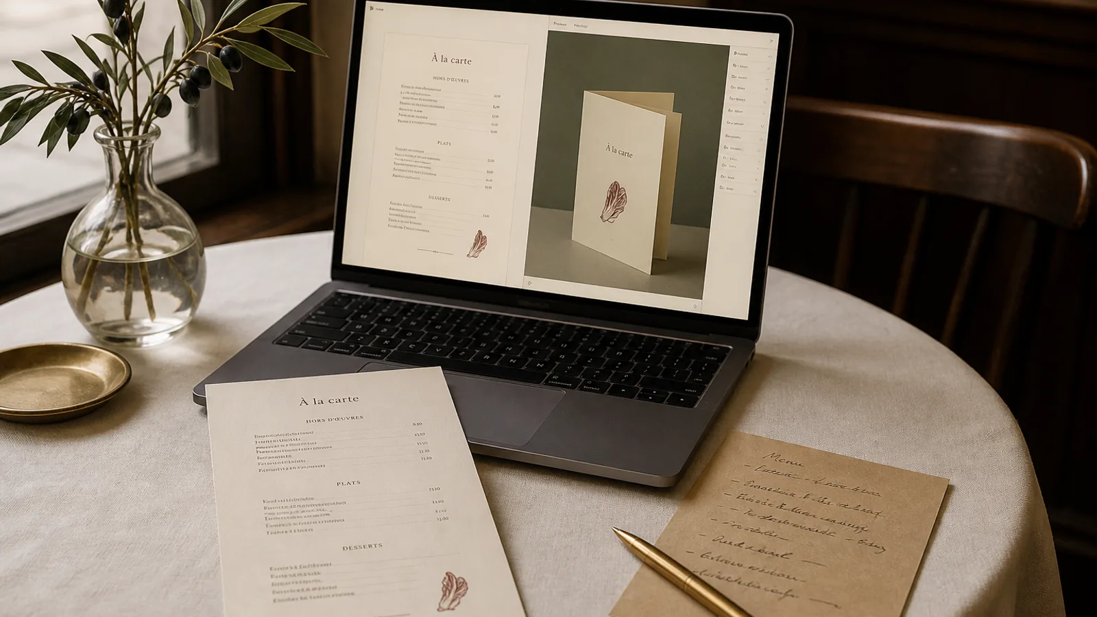
The difference between an AI-generated menu that looks like a template and one that looks like it was made for your room is almost entirely in the sentence you typed before pressing generate. Not the dish list, which is data; not the logo, which is fixed; the short description of what the place feels like. Having read a few thousand of these briefs, the pattern is clear: the good ones say specific things about materials, light and tone, and the weak ones say adjectives. This article shows how to write the sentence, what to leave out, and how to use the second and third generation rather than wasting them.
What the AI actually does with your sentence
A menu design system takes your brief and converts it into decisions: a type pairing, a colour palette, margin proportions, the weight of rules and ornaments, how much white space sits between dishes, whether prices sit flush right or hug the description. Words like elegant or modern give it nothing to decide with, because every restaurant thinks it is both. Words like walnut, brass, candlelight, handwritten specials board, 1970s trattoria give it a material world to translate into type and colour.
The AI is also reading your dish list and photos. If the brief contradicts them (a fine-dining brief for a menu of burgers and wings), the result is confused. Describe the place you actually run.
The four things a good brief contains
You do not need a paragraph. One or two sentences with four kinds of content will outperform anything longer.
- A material or a place: the room's dominant surfaces, or a real reference (a 1950s Lyon bouchon, a Copenhagen bakery, a Lisbon tasca with tiled walls).
- A tone of voice: how the staff speak to guests. Warm and informal, precise and quiet, playful, ceremonial.
- A constraint on density: how many dishes must fit and whether the menu should feel generous or compact. Forty dishes on one A4 page is a different design from twelve.
- One thing to avoid: the cliché you refuse. No script fonts, no chalkboard look, no photos of food, no gold.
An example that hits all four: Small neighbourhood bistro, zinc bar and dark green banquettes, we talk to guests like regulars; 28 dishes on A4 double-sided with a short wine list on the back; nothing rustic or hand-drawn. That sentence produces a recognisable design on the first try.
What to leave out
Leave out font names unless you own the licence and are sure. Asking for Garamond gets you a Garamond, and it may not be the right answer for your room; asking for a bookish, slightly old-fashioned serif lets the system pick among several and match it to a companion sans. Leave out colour codes unless they are your actual brand colours; describe the colour by material (oxblood, unbleached linen, slate) and let the palette be built around it. Leave out layout instructions like two columns or prices on the right; those are decisions the system makes from your dish count and format, and you can adjust them afterwards.
Above all, leave out the list of adjectives. Elegant, modern, clean, sophisticated, premium: these describe nothing. If you find yourself writing them, replace each with the thing in your room that made you think of it.
Using the second and third generation well
The first generation is a diagnosis, not a result. Look at it and name one thing that is wrong, in the same concrete language: the headings are too loud for the room; the prices feel like a spreadsheet; it reads as a café and we are a dinner place. Then change the brief in one dimension, not five, and generate again. Changing one thing per generation is how you learn what the words are doing.
By the third generation you should be adjusting details rather than direction: a slightly warmer paper tone, a lighter rule between sections, more space around the section headings. If you are still changing direction at generation five, the brief is missing one of the four elements above, usually the material or the constraint.
When to stop generating and start editing
Once the type, palette and density feel right, stop. Everything else (a dish that wraps to two lines, a price that needs a decimal, a section that would sit better on the other face) is editing, not generation, and regenerating to fix it throws away decisions you already liked.
Briefs for specific situations
A lunch formula and a dinner menu for the same room should share the brief and differ only in the density constraint. A wine list should reference the food menu (same room, same tone, but denser and calmer, more columns). A seasonal menu should keep the brief and add a single seasonal cue (early autumn, mushrooms and game, slightly darker palette) rather than starting from scratch, so the family resemblance holds across the year.
For a new restaurant with no room yet, brief from the plans and the mood board: the floor material, the light fittings, the crockery you have ordered. Those are the things guests will see next to the menu.
One sentence, written like a designer would hear it
Write about materials, tone, density and one refusal. Skip the adjectives, the font names and the layout micro-management. Change one thing at a time. Most owners who work this way have a design they would happily print by the third generation, and the fifteen free generations become a comfortable margin rather than a limit.
In Menu Atelier, the mood sentence is the single text field you fill in after pasting your dishes and uploading a logo; the eight starting styles are there for when you would rather point at a reference than describe one, and you can still refine the brief from any of them.