Japanese-inspired menu design: asymmetry, washi and space
Principles behind a Japanese-inspired menu that avoids pastiche: asymmetric grids, generous emptiness, textured paper, one vertical accent, a single red seal, quiet type.
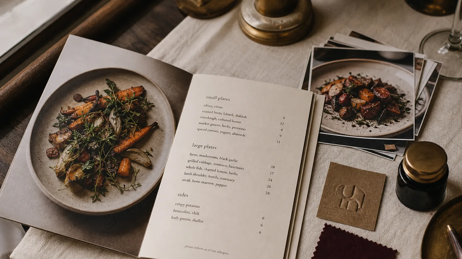
Most Western attempts at a Japanese-feeling menu reach for the same props: a brush-stroke font, a red circle, a bamboo border, a cherry blossom. The result reads as a theme restaurant rather than a serious kitchen. What actually makes Japanese graphic design distinctive is structural, not decorative: an asymmetric balance, a willingness to leave two thirds of the page empty, a respect for the paper as a material, and a very small number of marks placed with care. This article translates those principles into a printed menu for a European restaurant, whether it serves sushi, ramen, izakaya plates or a French kitchen with a Japanese sensibility.
Asymmetry that is still balanced
Western menus are usually symmetrical: centred title, two equal columns, prices in a straight line. Japanese composition, from scroll painting to modern poster design, prefers the off-centre. The restaurant name sits high in the top-right or low in the bottom-left corner, the dish list occupies a column that starts a third of the way down, and the empty area is not leftover space but a deliberate counterweight.
In practice, build a grid of six columns on an A4 or A5 page and use only four of them for content, leaving two as a margin on one side. Align dishes to the left edge of that content block and prices to its right edge, and let the block float rather than centring it. The card should look like it could tip and does not.
Emptiness is the design
The concept usually translated as negative space is treated in Japanese aesthetics as an active element, not an absence. On a menu it means margins of 20 mm or more, generous space between sections of at least two line heights, and a refusal to fill a panel because it is there. If a bifold's inside-right panel has only six dishes, they sit in the upper half and the lower half stays empty.
This has a practical consequence: a Japanese-inspired card holds fewer items per page than a bistro card. Twelve to eighteen dishes on an A4 face is the comfortable maximum. If your list is longer, use a bifold or a second sheet rather than compressing.
Paper as material: washi and its substitutes
Real washi is too fragile and too expensive for a daily menu, but its qualities can be approximated. Choose an uncoated stock with visible fibre or a laid texture, in a natural white or a very pale grey rather than bright white, at 250 to 300 g. Avoid anything glossy; the surface should absorb light and take fingerprints without showing them. Some mills offer papers with a slight translucency or a felt-marked surface that give the right hand without the fragility.
Print sparingly on this kind of paper. Uncoated textured stock lowers contrast and softens edges, so keep type at 10 pt or above and avoid large solid areas of ink, which will look uneven on a fibrous surface. The paper should do most of the visual work; the ink is a guest on it.
Typography: quiet, light, with one vertical gesture
Do not use a brush-stroke or « oriental » display font for Latin text. They are caricatures and every Japanese guest will notice. Use a light or regular geometric sans, or a refined humanist serif, in one weight for everything except the restaurant name. Section titles can be set in small capitals with wide letterspacing at 9 to 10 pt, which gives hierarchy without volume.
One vertical element earns its place: the restaurant name or a single Japanese word set vertically along the outer edge of the page, rotated 90 degrees or, if you have the real characters and someone who can check them, set in genuine vertical script. This single gesture does more to locate the card than any amount of pattern. Never print Japanese characters you cannot verify; a misused kanji is the equivalent of a menu that says « Restaurant » in a random European language.
One mark in red
The traditional red seal, or hanko, gives Japanese documents their single point of colour. On a menu, one small red element does the same: a square or round mark of 8 to 12 mm carrying the restaurant's initial or a simple symbol, placed near the name but not centred on it. Keep the red slightly toward vermilion rather than magenta, roughly 0 % cyan, 90 % magenta, 90 % yellow, 5 % black, and use it nowhere else on the card. A second red element halves the effect of the first.
- One typeface, one weight, one accent colour.
- Vertical text once, on the outer edge.
- No borders, no bamboo, no waves, no blossom, no brush fonts.
- Photos only if they are full-bleed on the cover and shot with the same restraint; otherwise none.
- Allergen key in the same quiet type at 8 pt, placed in the empty zone rather than squeezed under the dishes.
Format: tall and narrow, or a single fold
The proportions of Japanese print are often taller than the ISO 216 A-series. A DL card or a tall custom trim close to 1:2 suits a short omakase or drinks list. For a fuller menu, an A5 bifold opening to A4 landscape gives four panels, and the left-hand panel can be left almost empty as the counterweight to the three panels of content. Single-sided printing on textured board, with the reverse left as bare paper, is itself a statement of restraint.
Restraint as the whole method
Every decision above is a subtraction: fewer items, fewer colours, fewer marks, more paper. The card that results looks calm from across the room and rewards a closer look, which is the same thing the cuisine is trying to do. In Menu Atelier the Sushi Zen style is built on exactly this grammar: an asymmetric grid, wide margins, a single vertical accent and one red mark, on a paper texture you can inspect in the 3D preview before choosing between a tall single sheet and an A5 bifold.