Matching your menu to your interior: materials, colours and mood
How to make a printed menu feel like it belongs in your room: reading the interior for palette, choosing paper to match materials, avoiding the mismatches guests notice.
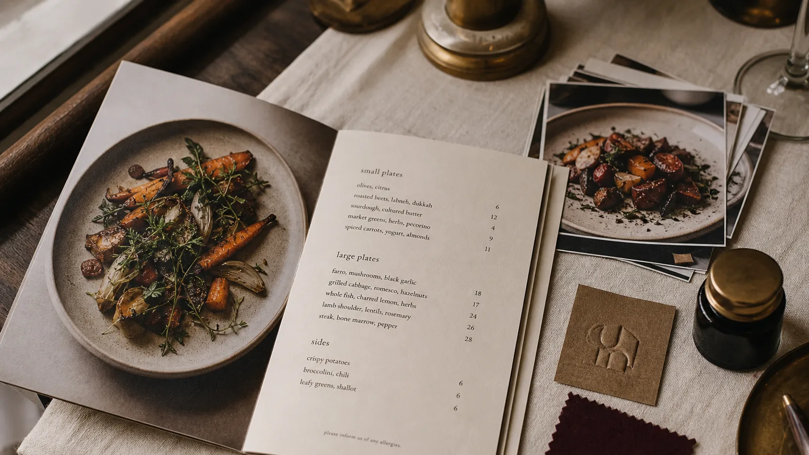
Walk into a room with oak tables, brass lamps and green velvet banquettes, then pick up a menu printed on glossy white paper in a purple sans serif. Nothing is technically wrong with either, but the guest feels the seam. The menu is the one piece of the interior a guest actually holds, so it should be made of the same decisions as the room. Here is how I read an interior before designing a card, and how those readings turn into paper, colour and type choices.
Start with the materials, not the colours
Owners usually begin by matching colours, but texture is what the hand notices first. List the three dominant materials in the room: for a bistro it might be dark wood, zinc and tile; for a modern café, concrete, pale birch and steel; for a fine-dining room, linen, walnut and stone. Each of these has a paper equivalent.
- Dark wood and leather ask for an uncoated, slightly toothy board in cream or natural white, 300 to 350 g, with a matte finish that absorbs light the way the wood does.
- Concrete, steel and glass ask for a smooth, cool white board; a soft-touch laminate gives the same slightly velvety hand as a polished concrete counter.
- Linen and stone ask for a heavy, tactile stock, often with a visible felt or laid texture, printed with restraint so the paper itself is part of the design.
- Tile, marble and mirror suit a crisp coated board where fine lines and small type stay sharp.
Get the paper right and a guest will feel the match before they have read a word.
Pull the palette from the room, then desaturate one step
Photograph your room at service time, under the actual lighting, and pick colours from the photo rather than from a paint chart. The green of the banquette under a warm 2700 K bulb is not the green on the swatch; it is browner and darker, and the menu should match what the eye sees at the table, not what the decorator specified.
Then knock every colour back one step. A menu is small and held close; a colour that reads as elegant on a three-metre wall reads as garish on an A5 card. If the walls are a deep teal, the menu cover can be a slightly darker, less saturated teal, and the inside pages a warm off-white that echoes the ceiling or the linen. Use the strongest interior colour only as an accent for section headings or a rule under the restaurant name.
Let the lighting decide type size and contrast
Interior mood is set mostly by light, and light is what makes or breaks a menu's readability. In a bright café with daylight and white walls you can run body text at 9 pt in a mid-grey and it will read. In a candle-lit wine bar at 50 lux the same setting is invisible; you need 10.5 to 11 pt, full black or near-black ink, and a paper that is not so dark it kills contrast.
This is the point where the interior wins over the brand book. If your identity calls for pale grey type on charcoal but your room is dim, print dark on light and carry the mood through the paper texture and the cover colour instead. A menu guests cannot read is not on-brand; it is a complaint waiting to happen.
Match the furniture's geometry, not just its colour
Round bentwood chairs and curved banquettes suggest a card with rounded corners, a centred layout and a typeface with soft terminals. A room of straight-lined oak tables and square tiles suits a left-aligned grid, hard corners and a typeface with squared-off letterforms. These are subtle cues, but a card with 4 mm radius corners on a table full of hard edges quietly announces it was bought somewhere else.
Ornament follows the same logic. Art deco fixtures welcome a fine geometric border; a Scandinavian room with no mouldings should have a menu with no rules or frames at all. If you would not hang it on the wall, do not print it on the card.
Physical format and how the menu lives on the table
Look at your table size. On a 60 cm bistro table for two, an A4 menu covers half the surface and knocks over glasses; an A5 bifold or a tall narrow card fits. On a large fine-dining table an A5 looks lost and an A4 single sheet, or a bifold that opens to A3, sits properly. Consider how the menu is presented too: handed over, left in a stand, tucked between salt and pepper. A card that stands in a holder needs 350 g at least or it will slump within a week.
Dark interiors also hide dark menus. A near-black card on a dark walnut table disappears; give it a light edge, a light inside or a contrasting cover so it can be found.
A ten-minute test before you print
- Print a draft on plain paper, sit at the worst-lit table at 8 pm and read the smallest line. If you squint, increase type size or contrast.
- Lay the draft next to a napkin, a plate and a glass on the actual table. Do the colours sit comfortably or does one shout?
- Hold it against the nearest wall and the nearest piece of furniture. If it disappears into either, adjust the cover colour.
- Ask a member of staff to describe the room in three words, then the menu in three words. If the lists do not overlap, something is off.
Bringing the room onto the page
The goal is a card that could only belong to this room. Take the paper from the materials, the palette from the room under its own light, the type size from the lighting level and the geometry from the furniture, and the rest is detail. In Menu Atelier you can describe the room's mood in a sentence and upload a few interior photos alongside your logo; the layout picks up the palette and tone from them, and the 3D preview lets you see the card under a warm or cool light before choosing the format and sending it to print.