The menu as a marketing tool: what guests take home in their head
The printed menu is the only ad every guest reads for several minutes. How to use it to shape memory, drive return visits and word of mouth without turning it into a flyer.
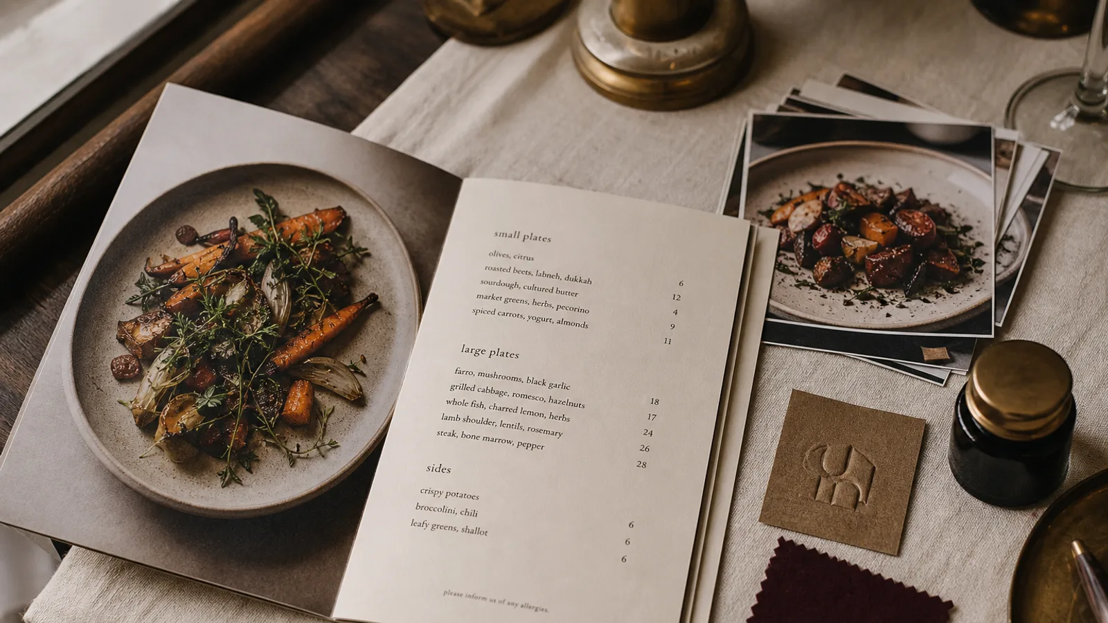
Ask a guest a week after dinner what they remember, and you will hear about one dish, one moment of service and, surprisingly often, the menu itself: « it was on this thick brown card », « they had a little story about the grandmother ». Nobody remembers your Instagram post from that week. The menu is the only piece of marketing every single guest reads, at reading distance, for several minutes, while deciding how much to spend. This article treats it as such: not as a price list, but as the thing guests carry out in their heads.
Three things a menu can plant
A menu can leave three kinds of memory. A signature: one dish or drink that becomes the reason to come back and the thing to tell friends about. A story: a sentence or two about who you are that gives the guest something to repeat. A feeling: the weight of the paper, the calm of the layout, the sense that someone cared. Most menus try to do none of these and simply list everything at the same volume. The marketing job is to choose which of the three you are after and design for it deliberately.
Make one dish impossible to miss
Word of mouth runs on specifics. « The food was good » sends nobody to your door; « you have to try the lamb shoulder they cook for eight hours » does. Pick one dish with a good margin that you can make consistently, and give it a different treatment on the page: a box, a slightly larger name, two lines of description where other dishes get one, a « since 2014 » or a note about where the lamb comes from.
Cornell's menu research is clear that a boxed or highlighted item sells more; what matters for marketing is that it also gets talked about more. One highlight per page. Two competing highlights cancel each other out and the guest remembers neither.
Give them a sentence to repeat
A guest who can say one true thing about you to a friend is worth more than any paid campaign. That sentence should be on the menu, short enough to remember and specific enough to be interesting: « We buy the whole animal from one farm in the Aubrac », « The sourdough is 36 hours old when it reaches your table », « The room was a hat shop until 1987 ». Put it on the cover, the back panel or under the restaurant name, in 9 to 10 pt, no more than 40 words.
Avoid adjectives that do not carry information. « Passionate », « authentic » and « unforgettable » are forgotten before the starters arrive. A fact with a number or a place name is remembered.
Design the feel, not just the look
Guests do not talk about typography, but they do talk about how a place felt, and the menu is the object that carries that feeling into their hands. A 350 g board with a soft-touch finish feels considered; a laminated sheet feels like a chain. Generous margins of 15 mm or more read as calm; a page crammed to 5 mm reads as anxious. The choice of paper and white space is a marketing decision with a cost of a few cents per menu and a lifespan of every service until you reprint.
- Heavy uncoated board in a warm white for places selling comfort and craft.
- Smooth cool white with lots of air for places selling precision and modernity.
- A dark cover with a light interior for bars and evening rooms, so the object itself signals the shift from day to night.
- A bifold rather than a single sheet when you want the small ceremony of opening something.
The back panel is free advertising space
On a bifold, the back panel faces the room every time a guest reads the inside. On a single sheet, the reverse is seen when the card is put down. This surface is routinely wasted on a blank or a logo. Use it for one thing you want to happen next: the private dining room, the Sunday lunch, the fact that you sell the house vinaigrette by the bottle, the name of your newsletter with a short line on why it is worth having. One message, large enough to read from across the table, never more.
Consistency turns one visit into a habit
Return visits depend on recognition. If the card the guest picks up in October looks like the one from June, only with new dishes, they are back in a place they know. If it looks like a different restaurant, the memory does not attach. Keep the format, the paper, the typefaces and the position of the signature dish stable across seasons; change the content freely, the container rarely. A menu redesign should happen every few years, not every quarter.
What to measure
- The sales share of your signature dish before and after highlighting it. A move from 8 % to 15 % of covers is typical when the highlight is well placed.
- How often servers hear the story back: « is it true the room used to be a hat shop? » is the sound of the sentence working.
- Mentions of the menu itself in online reviews; guests who photograph a menu and post it are giving you distribution for free.
- Average ticket per cover, tracked across each menu version so you know which layout actually paid for itself.
A menu that leaves with the guest
Everything a guest remembers about you was either eaten, said or read, and the reading part is entirely under your control. Choose the dish, write the sentence, pick the paper, and leave the rest of the card quiet enough that those three things land. In Menu Atelier you can highlight a dish with a box or a larger treatment in one click, add a short about paragraph that the layout reserves space for on the cover or back panel, and check in 3D that the whole card, front and back, reads as one coherent object before ordering the print run.