Menu copy mistakes: typos, inconsistencies and the capital-letter epidemic
The copy errors that make a restaurant menu look cheaper than the food: misspelled dishes, mixed capitalisation, inconsistent prices and units, and a fix for each one.
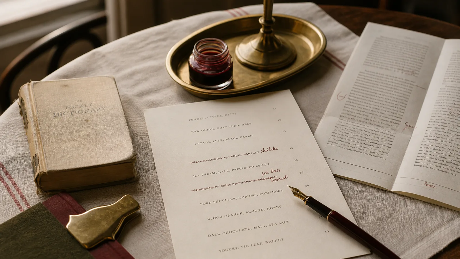
A guest who spots "Ceasar salad" on your menu forgives it. A guest who then sees "Expresso", "Mozarella", a starter at 9,50 and another at 9.5, and a section where every Word Is Capitalised, does not forgive any of it; she concludes that nobody in this restaurant looks closely at things, and she wonders whether that applies to the kitchen. Copy errors are cheap to fix and expensive to leave. This article catalogues the ones that appear on most menus, explains why each one happens, and gives the rule that prevents it.
The capital-letter epidemic
The single most common problem on English-language menus is title case applied to everything: "Grilled Octopus With Smoked Paprika And New Potatoes". It comes from a belief that capitals look important. They do not; they look like a headline, and a page of headlines has no hierarchy. In French, Italian and Spanish the problem is imported from English and looks even stranger, since those languages capitalise almost nothing.
The fix is sentence case: capitalise the first word of the dish name and proper nouns only. "Grilled octopus with smoked paprika and new potatoes." Proper nouns include place names, protected designations and brand names (Parmigiano Reggiano, Espelette, Champagne as the wine), but not ingredients that happen to sound grand (parmesan as a generic, champagne vinegar, caesar salad in lower case is now standard in most style guides).
Related: the random capital inside a line. "Beef Tartare, capers, Shallots" shows that two people edited the same line at different times. When you find one, read the whole section; there are always more.
The misspellings everyone makes
Food vocabulary is full of borrowed words and the same dozen are misspelled on menus across Europe. Print this list and check your card against it.
- Caesar, not Ceasar or Cesar (unless you mean the Spanish name). Espresso, not expresso. Mozzarella with two z and two l. Bruschetta, not bruscetta. Prosciutto with two t.
- Crème brûlée with both accents; crème fraîche with both; chèvre; gruyère; jalapeño; pimentón; tagliatelle (not tagliatelli); gnocchi; pappardelle with two p.
- Hollandaise, béarnaise, béchamel: the sauces named after places or people follow French spelling and accents even on an English menu.
- Whisky (Scotch, Japanese) versus whiskey (Irish, American): if you list both, spell each correctly. Rosé needs its accent or it reads as the past tense of rise.
Accents are not decoration. A menu that writes "creme brulee" is not simplifying, it is misspelling, and every French-speaking guest sees it. If your typeface lacks proper accented characters (some display fonts do), change the typeface for the body text.
Price formatting: one system, every line
Prices are the most-read text on the menu and the most often inconsistent. Common mixes on a single card: 12 and 12.00; 9,50 and 9.5; 14 € and €14 and 14€; a currency sign on some lines and not others. Each one is small; together they signal carelessness.
Decide three things and apply them everywhere. First, the decimal convention: in French, Italian and Spanish the comma is the decimal separator (9,50), in English the point (9.50); never mix them, even on a bilingual card, where prices should follow the primary language. Second, whether to show decimals at all: whole euros only (12, 14, 18) reads calmer and fits the current norm in bistro pricing; if you need 50 cents, then every price shows two decimals (12,00, 14,50). Third, the currency mark: either the € sign after the number with a space (12 €), as is correct in French, Italian and Spanish, or no sign at all with a single line at the foot of the menu: "Prices in euros, tax and service included". Showing the sign on every line is a habit inherited from US menus and clutters the column.
Units, numbers and abbreviations
The same discipline applies to everything numeric. Pick one form for each and write it on your style sheet.
- Weights: 200 g with a space and no full stop, not 200g, 200 gr or 200 grs. Steak weights are a classic place to find three forms on one page.
- Volumes: 12,5 cl or 125 ml, not both; glass sizes on the wine list all in the same unit.
- Time: 48 h or 48 hours, 24-month or 24 months, but not 48h on one line and 36 hours on the next.
- Numbers in words versus figures: small counts in words (two eggs, three cheeses) and measurements in figures (200 g, 36 months). Mixing "2 eggs" and "three cheeses" in the same section is jarring.
- Abbreviations: avoid them on the dish line altogether. "w/" for with, "veg" for vegetables and "sce" for sauce belong on the kitchen's prep list, not the guest's card.
Inconsistency in structure, not just spelling
Structural inconsistency is harder to see than a typo and just as visible to the reader. Two dishes in the same section: one with a description, one without. One description ending with a full stop, the next without. One dish listing ingredients separated by commas, the next by middle dots. One heading in small caps, the next in bold.
The fix is a template line. Write one dish in its final form and copy its structure for every other dish: name, then description (or nothing), same separator, same ending punctuation, same order (main ingredient first, garnish last). Choose whether descriptions end with a full stop and apply it to all of them; the convention on most professionally set menus is no full stop for noun-phrase descriptions and a full stop for full sentences.
Watch also for the orphan dish: a section with a single item, usually a leftover from a menu change. Merge it into a neighbouring section or give it company.
How mistakes survive to print
Menu errors persist because the person who wrote the menu is the person who proofreads it, and because the proofreading happens on a screen at the end of a long day. Three habits break the pattern. Proof on paper, at the printed size, with a pen. Ask someone who did not write it to read every word aloud, slowly, including prices. Keep a one-page style sheet (capitalisation, price format, units, accents, banned abbreviations) so the next menu change does not reintroduce the same problems.
Spell-checkers help less than expected: they flag guanciale and let "expresso" pass. A dictionary of food terms is worth more than the red underline.
Small errors, large message
None of the mistakes above changes what arrives on the plate. All of them change what the guest expects to arrive. A menu with consistent capitals, correct accents, one price format and one structure per line does not look impressive; it looks like nobody had to think about it, which is exactly the effect you want.
In Menu Atelier the price format, decimal separator and currency placement are set once per menu and applied to every line automatically, so a card cannot mix 9,50 and 9.5; when you paste your dishes, capitalisation and separators are normalised to a single convention, and you can override any line before exporting the print files.