Delivery app menu vs dine-in menu: same dishes, different design
Why a delivery app menu should not copy the dine-in card: which dishes to list, how to write for a phone screen, photos, pricing under commission and categories that sell.
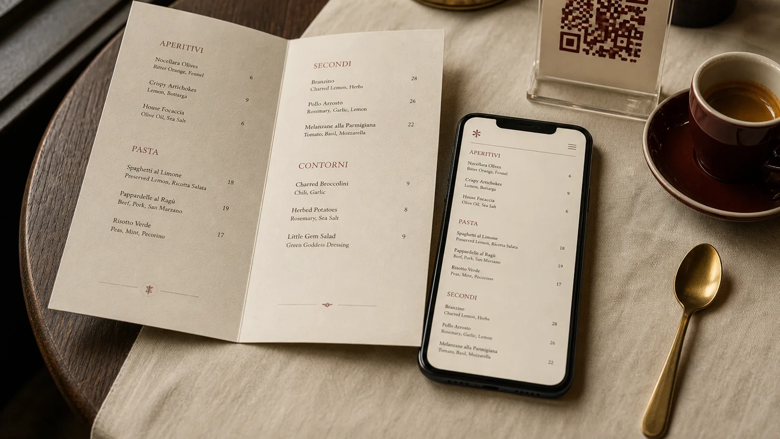
A menu read at a table is a conversation with a server nearby, a room that smells of the kitchen and a wait the guest has already accepted. A menu read in a delivery app is a list scrolled with one thumb, against thirty competitors, by someone who is hungry now and will decide in ninety seconds. The dishes may be identical; the document cannot be. This article goes through what changes between the printed card and the app listing, from which dishes to include to how to write, photograph and price them, and how to keep both in step without running two kitchens.
Not every dish should travel
The first design decision is editorial: cut. A soufflé, a crispy-skin fish on a purée, a salad dressed in the kitchen, a risotto that should be eaten within four minutes of leaving the pan: these dishes damage your reputation when they arrive after 35 minutes in a box. Restaurants that do delivery well usually list 60 to 70 percent of the dine-in card and add two or three items built for transport, such as a braise, a rice bowl or a sandwich that improves as it rests.
Test each dish honestly. Pack it as you would for a courier, leave it on the counter for 30 minutes, then open it and eat it. If you would not serve it, do not list it. Guests do not blame the courier or the box; they blame the restaurant, in a review that stays online.
Writing for a thumb, not a table
On the printed card, a dish name can be short and evocative because the server fills in the rest. In the app, the name and the first line of the description are all the guest sees before tapping. Uber Eats truncates names around 40 characters and descriptions around 100 characters in list view; Deliveroo and Just Eat behave similarly. Write names that identify the dish in the first four words and descriptions that answer the three at-home questions: what is in it, how big is it, what comes with it.
- Dine-in: “Chicken, tarragon, grenaille potatoes.” Delivery: “Roast half chicken with tarragon jus and roasted new potatoes, serves 1 generously.”
- Dine-in: “Burrata, tomatoes, basil oil.” Delivery: “Burrata (125 g) with heirloom tomatoes and basil oil. Bread included.”
- Dine-in: “Tiramisu.” Delivery: “Tiramisu, individual portion, contains alcohol and raw egg.”
Drop the poetry, keep the precision. Mention portion weight or count where it matters, because “large” means nothing on a screen. State spice level in words as well as with any icon. And write descriptions for the app in the same document as the printed card, side by side, so the same dish never has two names.
Photos: the app version of typography
On paper, most good menus have no photos at all; type and space do the work. In the app, photos are the layout. Listings with a photo on every item consistently outsell photo-less listings, and the platforms rank them higher. Shoot every dish you list, on the same background, in the same light, from the same angle, square or 4:3 at 1200 pixels minimum. A single afternoon with a phone, a window and a white board gets you 30 usable images.
Photograph the dish as it will be eaten at home, ideally in the actual container or on a plain plate, not the restaurant's presentation with tweezers and micro-herbs. Guests are comparing the photo to what arrives; the smaller the gap, the better the rating.
Pricing under commission
Platforms charge 25 to 35 percent per order, and this decision belongs on the menu, not in the accounts. Three policies exist. Same prices as dine-in and accept the margin loss, which only works if delivery is a small share of turnover. Delivery prices 10 to 15 percent higher, which is what most independent restaurants do and what guests broadly accept. Or a shorter delivery menu built around high-margin items, which combines the editorial cut above with the economics.
Whatever you choose, do not show two different prices for the same dish on channels a guest can compare in one glance. If you charge more for delivery, drop the dish names that make comparison trivial, or add a line on your website explaining that delivery prices include platform fees. Honesty here costs nothing and prevents the one-star review that starts with “they charge more on the app”.
Round for the screen. Prices that end in .90 read as manipulative in an app where the total is computed in front of the guest; whole euros or .50 look calmer. And keep the number of modifiers tight: three well-chosen options sell better than a twelve-line configurator.
Structure the platform will not let you control
In print you control order, hierarchy and white space. In the app, you control only categories, their sequence and the items within them. Use that. Put a category at the top with your five best-travelling, best-margin dishes, called something honest like “Favourites” or “Most ordered”, because the first screen decides most orders. Keep categories to six or eight; a guest scrolling twelve headings on a phone gives up.
Allergens go in the platform's dedicated fields, not in the description. Regulation 1169/2011 applies to distance selling as well as to the table, and the fields are how the platforms surface the information to guests who filter for it. Keep your allergen matrix in the same spreadsheet as your descriptions and prices so every channel reads from one source.
One source, two menus
The practical way to keep dine-in and delivery aligned is a single list of dishes with columns for each channel: dine-in name, delivery name, short description, long description, dine-in price, delivery price, allergen codes, photo file, availability. The printed card is one view of that list; the app is another. When a price or a dish changes, you change the row, then update the card and the app on the same afternoon.
Menu Atelier works from that same idea: you paste your dishes once, with prices and descriptions, and the AI lays out the printed card, in A4 or A5, single sheet or bifold, previewed in 3D before you download the print-ready bundle or order printed copies. The dish list you built for the card is the list you export to fill in the delivery dashboards, so the two menus start from the same words.