Menu design brief examples for ten kinds of restaurant
Ten ready-to-adapt mood sentences for briefing a menu designer or an AI tool, from neighbourhood bistro to sushi counter, with the density and refusal each room needs.
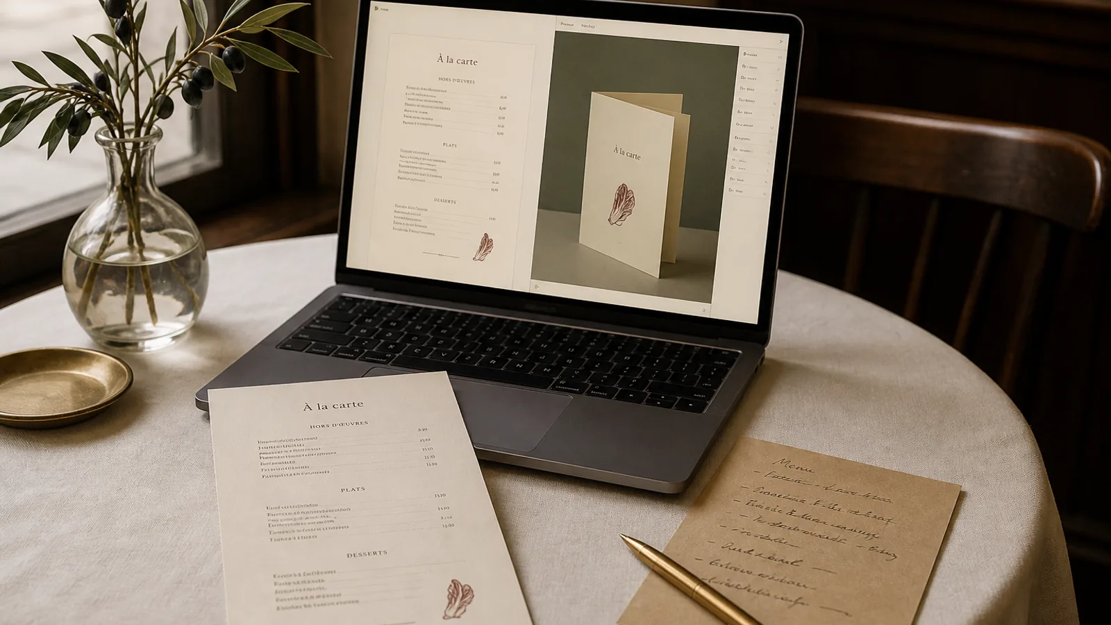
A brief that says elegant and modern produces a menu that could belong to anyone. A brief that names the zinc, the banquettes, the 28 dishes and the one cliché you refuse produces a menu that could only be yours. Below are ten sentences written the way a designer would want to hear them: material, tone of voice, density, one refusal. Steal the structure, change the nouns, and do not add a paragraph of adjectives on top.
What every brief in this list is doing
Each sentence carries four jobs. A material or a real place gives the system (or the human) something to translate into type and colour. A tone of voice tells them how the staff actually speak. A density constraint stops a 12-dish tasting card from being designed like a 40-line brasserie list. A refusal kills the cliché that would otherwise arrive by default: script fonts on a bistro, gold on a sushi bar, chalkboard on a place that has never owned a stick of chalk.
Keep the sentence under 50 words. If you need a second sentence, make it about format (A4 double-sided, A5 bifold) or about a second card (wine list, lunch formula) that must match. Do not name fonts unless you own the licence. Do not paste hex codes unless they are already on the awning.
Neighbourhood bistro, trattoria, and the room that already exists
Small neighbourhood bistro, zinc bar and dark green velvet banquettes, we talk to guests like regulars; 28 dishes on A4 double-sided with a short wine list on the back; nothing rustic, nothing hand-drawn. That sentence has launched more usable first drafts than any mood board of Paris postcards. The zinc and the velvet give a cool metal and a deep green; the tone keeps the type from going ceremonial; 28 dishes forces two columns or a tight single; the refusal stops the ivy-and-script default.
Family trattoria, terracotta floor, paper place mats, the nonna still walks the room; 22 primi and secondi plus a short list of contorni on A3 or a large A4, prices honest and close to the name; no gold, no English puns, no photos of food. Here the density is higher and the paper can be cheaper in the hand, but the type should still be a real old-style serif, not a fake trattoria display face. If you print on 350 g you will look more expensive than the room; 250 to 300 g uncoated is often truer.
Fine dining, tasting, and the card that is a programme
Quiet dining room, linen, low light, we do not explain the joke; eight-course tasting on one A5 face, wine pairings on the other, no prices on the course list, one line at the foot for the 145 € and what it includes; no ornaments, no logos larger than 18 mm, no dotted leaders. A tasting card is a programme. If you brief it like an à la carte you will get columns and prices and the evening will feel like a transaction.
Hotel restaurant that must serve breakfast, lunch and a serious dinner from one visual family: same type pairing and same cream board, three densities. Breakfast is 18 lines on A5; lunch is a 32 € formula plus six à la carte; dinner is 24 dishes. Brief the family once, then change only the density sentence for each service. That is how the brand holds when the same guest sees all three cards in a weekend.
Counter rooms: sushi, ramen, burger, café
Sushi counter, hinoki, indigo noren, we speak softly and the menu is short; 16 nigiri and six plates on a tall narrow card, 105 × 297 mm, prices in old-style figures, soy and wasabi assumed; no red, no gold foil, no illustrations of fish. The tall format is part of the brief because a wide A4 on that counter looks like a takeaway flyer.
Ramen bar, stainless, tickets, we shout the order back; 12 bowls and six sides on one A4 face, large names, short descriptions or none, allergens as a numbered key at the foot; no script, no watercolour noodles, no photographs. Burger room, neon, terrazzo, we are loud on purpose; 10 burgers, 6 sides, 8 shakes on A5 bifold, names in a heavy grotesque, prices flush right; no serif, no kraft paper cliché unless the room is actually kraft. Neighbourhood café, marble dust tables, we know the regulars' milk; 14 savoury, 12 cakes, coffee list on the back of A4; no chalkboard look, we have a real printer.
- Sushi: short list, tall card, no gold, no fish drawings.
- Ramen: large names, few words, numbered allergen key, no script.
- Burger: heavy grotesque, bifold, no fake kraft unless the room is kraft.
- Café: two faces, cakes and coffee split, no chalkboard pastiche.
Wine bar, cocktail bar, and the list that is the product
Wine bar, oak barrels we actually use, candlelight, we talk about growers not scores; 80 bins by-the-glass and bottle on A4 bifold, producer and vintage in 8.5 pt, prices in a quiet column, regions as the only headings; no tasting-note poetry, no grape-variety icons, no gold. Density is the whole problem here. Brief the number of bins or the system will design for 30 and you will paste 80.
Cocktail bar, brass and oxblood leather, we take the drink seriously and the room less so; 18 signatures and 12 classics on A5, names large, ingredients in one line, prices without a currency mark if the room can carry it; no photographs of glasses, no neon type unless the sign outside is neon. Art Deco Cocktail as a starting style is a reference, not a costume: if your room is 2020s concrete, say so and refuse the fan ornament.
Seasonal pop-up and the room that will vanish
Six-week summer pop-up in a covered market, plywood, string lights, we will not reprint weekly; 16 dishes that will change twice, A5 single sheet, space to strike a line and write a substitute; no lamination, no 40-dish ambition, no logo we do not have yet. For a room that lasts a month, the brief should mention reprinting, because a beautiful 350 g bifold that you cannot afford to remake in week three is the wrong object. A single sheet you can regenerate and print in two days is the right one.
How to steal these without sounding like someone else
Replace every noun with something in your room. If you do not have zinc, do not write zinc. If you have linoleum and a pass you can see from the door, write that. Keep the four jobs. Run the sentence once, look at the first generation, and change one job only: the refusal if the cliché arrived anyway, the density if the type is too small, the material if the palette is from the wrong decade.
Two rooms that share a kitchen but not a mood need two sentences, not one sentence with and. A lunch canteen and a Friday-night wine bar upstairs are different products. Brief them separately and share only the logo file.
One sentence, ten rooms, then print
Write the material, the voice, the count of dishes, and the thing you will not tolerate. That is the whole brief. The ten examples above are starting points, not costumes. A competent designer, or a system that has been built to read this kind of sentence, will do more with those forty words than with a two-page creative deck.
In Menu Atelier the mood sentence sits next to your dish list and logo; the eight starting styles (Bistro Classic, Trattoria Rustica, Sushi Zen, Art Deco Cocktail and the rest) are there when you would rather point than describe, and you can still rewrite the sentence and regenerate before you turn the card in 3D and export.