Menu headings that organise: starters, small plates or something else?
How to name and order the sections of a restaurant menu so guests find their way: classic courses, sharing formats, ingredient-led sections and the headings that confuse.
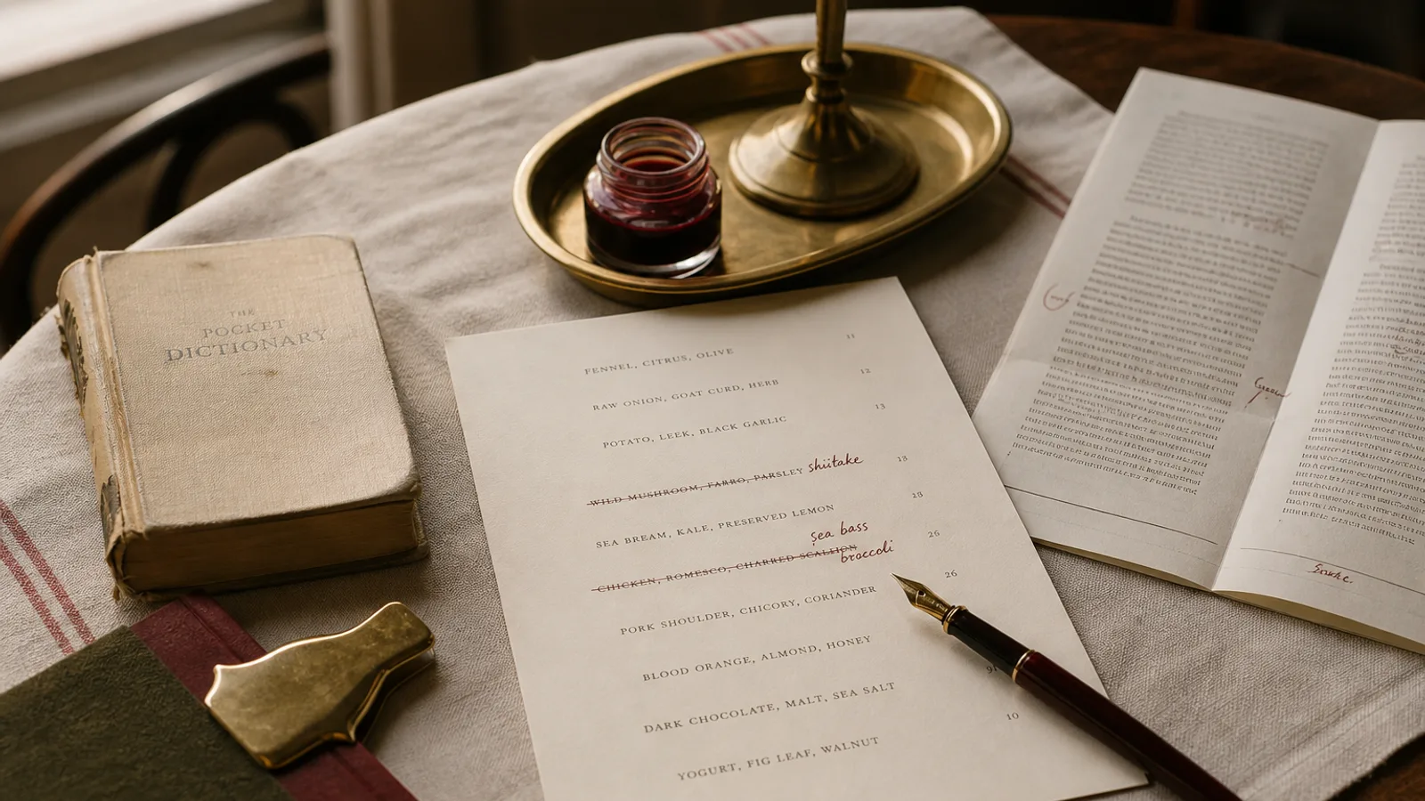
Section headings are the only words on a menu that every guest reads. Nobody reads all 34 dishes; everybody reads the six headings, in about two seconds, to decide where to look. If those headings are unclear, the guest reads the whole card slowly and orders late; if they are clear, she goes straight to the part that interests her and orders with confidence. This article is about choosing headings that do that job: the classic course structure and when it still works, the sharing and small-plates formats, ingredient-led and time-led alternatives, and the fashionable headings that quietly cost you covers.
The classic course structure and why it still works
Starters, mains, desserts (or entrées, plats, desserts; antipasti, primi, secondi, dolci; entrantes, principales, postres) has survived because it matches how most people in Europe eat a restaurant meal and how a kitchen sends it. It needs no explanation, it tells the guest how many decisions to make, and it makes prices comparable within each section. If you run a bistro, a trattoria or a neighbourhood restaurant with plated food, it is almost certainly the right structure.
Its limits appear when the food does not fit. A cheese course, a soup that can be either starter or main, a pasta that is a main in France and a primo in Italy, or a run of dishes designed to be shared all sit awkwardly in a three-course grid. The mistake is to force them into it with an asterisk. The better answer is to add one honest heading: "To share", "Pasta", "From the grill", and keep the classic three for the rest.
Small plates and sharing: name the format, then explain it once
A menu built for sharing has one job its headings must do that a classic menu does not: teach the guest how to order. The Cornell menu studies on ordering behaviour are clear that uncertainty about portion and quantity delays ordering and lowers spend; a sharing menu that does not say "we suggest three plates per person" will get two, and a table that goes hungry.
Use headings that describe size or role, in ascending order: "Snacks", "Small plates", "Larger plates", "Sides", "Sweet". Then add one line under the first heading, in italic: "Dishes arrive as they are ready; three or four per person makes a meal." That single sentence removes the awkward conversation with the server and increases the average order. Do not call everything "tapas" unless you serve Spanish food; the word carries a cuisine, not just a size.
Ingredient-led and method-led headings
Some menus are better organised by what the food is than by when it arrives. A seafood restaurant might use "Raw", "Shellfish", "Whole fish", "Fried". A grill house: "From the coals", "From the pan", "Salads", "Sides". A pizzeria: "Red", "White", "Calzone". These work when the kitchen genuinely has an organising principle and when the guest comes for that principle.
The risk is losing the course logic entirely, so the guest cannot tell what a meal is. Combine the two when needed: method-led headings for the centre of the menu, classic ones at the edges ("To start" before, "Dessert" after). And keep the heading words concrete. "From the sea" and "From the land" sound elegant and tell the guest less than "Fish" and "Meat".
Time-led headings: lunch, formule, menú del día
When the same card serves different moments, headings by time are the clearest: "Lunch, 12 to 14:30", "All day", "Evening only". Set menus deserve their own heading with the price in it ("Lunch menu, two courses 19 €, three courses 24 €") and a clear rule of what counts, because a set menu whose composition must be deduced from footnotes is a source of friction at the till.
Do not scatter the set menu across the card with symbols next to eligible dishes. Give it a block, list the eligible dishes by name inside it even if they repeat, and let the à la carte section stand on its own. Repetition costs a few lines; confusion costs a table.
The headings that confuse
Some headings are fashionable and almost always a mistake, because they describe the kitchen's mood rather than the guest's decision.
- "Beginnings", "Middles", "Endings" and their variants: charming once, but the guest has to translate them back into starters and mains, and the translation costs a beat every time.
- "Classics", "Signatures", "Favourites": a heading that says these dishes are good implies the others are not, and gives no information about what they are or when they arrive.
- "Chef's selection" without content: if it is a tasting menu, call it a tasting menu and give the price and the number of courses.
- Single-item sections. A heading with one dish under it is a leftover from a menu change, not a section. Merge it or add to it.
- Puns and in-jokes as headings. Keep humour for the chef's note; a heading that needs a second reading fails at the only thing a heading does.
How many, in what order, and how to set them
Five to seven headings is the range that stays scannable on an A4 or an A5 bifold. Below four, sections get long and the eye loses its place; above eight, the headings themselves become a list to read. Order them in the sequence of the meal, or in the sequence of decision (drinks and snacks first if you want the aperitif ordered early), and put the section you most want to sell where the eye lands first: top of the right-hand page on a bifold, top left on a single sheet.
Typographically, headings need to be clearly different from dish names without being loud. Small caps at 11 to 12 pt with generous letterspacing, or the display face of your identity at 14 to 16 pt, with at least one and a half lines of space above and half a line below. Never underline. Rules under headings are fine if they are thin (0.25 pt) and in the text colour. If your menu is bilingual, the heading carries both languages on one line (Antipasti · Starters) at the same size; it is the one place where two languages side by side read naturally.
Headings are the map
Everything else on the menu is territory; the headings are the map. Choose the structure that matches how your food is actually eaten, name each section with the plainest word that fits, explain the ordering logic once where the format needs it, and give the headings enough space and weight to be found in two seconds. Then leave them alone: guests learn a menu's map on the first visit and are grateful when it is the same on the second.
In Menu Atelier, sections are created as you paste or add dishes and can be renamed, reordered and merged by dragging; each of the eight styles has its own heading treatment, from the chalk-lettered headers of Café Chalk to the letterspaced small caps of Fine Dining Editorial, and the layout adjusts the space around headings automatically when you switch between A4 and A5 or from single sheet to bifold.