Illustrations and icons on menus: dietary symbols, ornaments and character
When a drawing earns its place on a menu and when it clutters: dietary and allergen icons that work at 3 mm, ornaments that fit the style, and how to source line art.
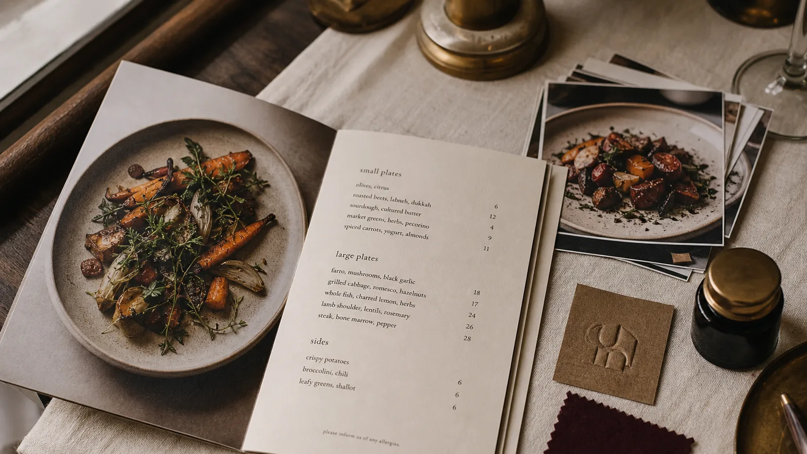
Somewhere between the plain typographic card and the photo-heavy catalogue sits the menu with drawings: a lemon in the corner, a little leaf next to the vegetarian dishes, a line of ornament under the restaurant name. Done with discipline, illustration gives a card character that neither type nor photography can. Done carelessly, it turns the menu into a scrapbook. This article separates the three jobs a drawing can do on a menu and gives you the sizes, counts and sourcing rules for each.
Three different jobs, three different rules
Icons inform: they tell a guest a dish is vegan, spicy or contains nuts. Ornaments structure: they separate sections, frame the page, echo the interior. Illustrations characterise: a drawing of the building, the chef's dog, the tomato variety you grow. Each of these has its own size, its own placement and its own failure mode, and the most common mistake is treating them as one category called « decoration ».
Dietary and allergen icons: legibility at 3 mm
The EU allergen regulation, 1169/2011, requires you to make the 14 listed allergens available to guests for every dish. Icons are one way to do this, but they only satisfy the rule if they are unambiguous and explained. A key at the bottom of the page is mandatory, and the key must name the allergen in words: a stylised fish must be labelled « fish », a wheat ear « gluten ».
At the size icons are usually printed, 3 to 4 mm, most illustrated symbols collapse into dots. What survives is simple, high-contrast geometry: a single leaf for vegetarian, a V in a circle for vegan, a chilli silhouette for heat. Keep the stroke weight at or above 0.25 pt at final size and the icon in solid black or your darkest brand colour, never in a pale tint. Test by printing the page on an office printer and holding it at arm's length; if you cannot tell the leaf from the chilli, neither can the guest.
- Use at most five distinct dietary icons; beyond that the key becomes a second menu.
- Place them consistently, either immediately after the dish name or in a narrow column before the price, never both.
- For allergens, many venues do better with small letter codes such as G, L, N in a fixed order plus a key; letters survive small sizes better than pictures.
- Never rely on colour alone to distinguish icons; around 8 % of men have some form of colour blindness.
Ornaments: the grammar of the style
An ornament is any non-figurative mark used to structure the page: rules, fleurons, borders, corner pieces, dotted leaders. Every style has its own grammar. A trattoria card can carry a double rule and a small fleuron between sections. An Art Deco cocktail list wants stepped geometric corners and a single hairline frame at 4 to 6 mm from the trim. A modern minimal card wants none at all, and adding even one flourish breaks it.
The rule of thumb is one ornament family per menu. Pick the fleuron or the rule or the frame, and repeat it; three unrelated decorative elements on one page is the visual equivalent of wearing every piece of jewellery you own. Ornaments should also stay clear of the bleed area: anything within 3 mm of the trim risks being cut, and a border that is 2 mm on one side and 5 mm on the other looks like a printing error even when it is a design error.
Illustrations: character in small doses
A commissioned drawing is the fastest way to make a menu feel like it belongs to one restaurant and no other. It is also the easiest thing to overdo. One strong drawing on the cover, or two or three small spot illustrations placed at section breaks, is enough for an A4 card. A drawing next to every dish stops being character and becomes noise, and it pushes the type down to make room.
Line art reproduces better than tonal drawing at menu sizes and on uncoated board. A pen-and-ink drawing scanned at 1200 dpi in bitmap mode prints crisp on any stock; a soft pencil sketch with grey gradations turns to mud on uncoated paper and needs coated board to survive. If you want colour, a single flat spot colour in your brand palette is safer than a full-colour watercolour, which will shift in CMYK and rarely matches your other printed material.
Sourcing: commission, licence or draw
- Commission a local illustrator. A set of three to five spot drawings in black line typically costs 300 to 800 € and gives you exclusive artwork you can also use on signage and packaging. Ask for vector files or 1200 dpi bitmaps and full commercial rights in writing.
- Licence stock illustration. Fine for icons, risky for character; the same lemon appears on a hundred other menus. If you go this way, buy the extended licence and recolour or crop so the source is not obvious.
- Draw it yourself. A confident owner with a fineliner can produce a charming logo-mark or a single cover drawing. Keep it simple, scan it at high resolution and have a designer clean the edges.
- Use icon fonts for dietary symbols. Consistent weight, scalable, and they sit correctly on the text baseline. Check the licence allows print.
Technical checks before the file goes to press
Icons and ornaments are small, so the errors are small too, and they multiply across a print run. Confirm every icon is vector or at least 1200 dpi bitmap. Confirm black elements are set to 100 % K, not rich black or a four-colour grey that will register badly at 3 mm. Check that thin ornament lines are at least 0.25 pt; hairlines at 0.1 pt disappear on uncoated board. And align the icons to a single baseline across the whole page; an icon that sits 0.5 mm higher on one line than the next is exactly the kind of thing guests cannot name but notice.
Letting drawings do only what they are for
Icons answer questions, ornaments organise the page and illustrations give it a face. Assign each drawing to one of those roles and remove anything that does not fit; a card with one good drawing and a clean set of five dietary icons will always beat one with twenty decorative flourishes. In Menu Atelier each style ships with its own ornament grammar and a matched set of dietary and allergen icons that stay sharp in the 300 dpi export, and you can add your own logo mark or a spot illustration and see it sit on the card in 3D before printing.