Restaurant brand identity basics: colours, type, tone and the menu as flagship
The four decisions that make up a restaurant brand identity, how to take them without an agency, and why the printed menu is the one object where all four must hold together.
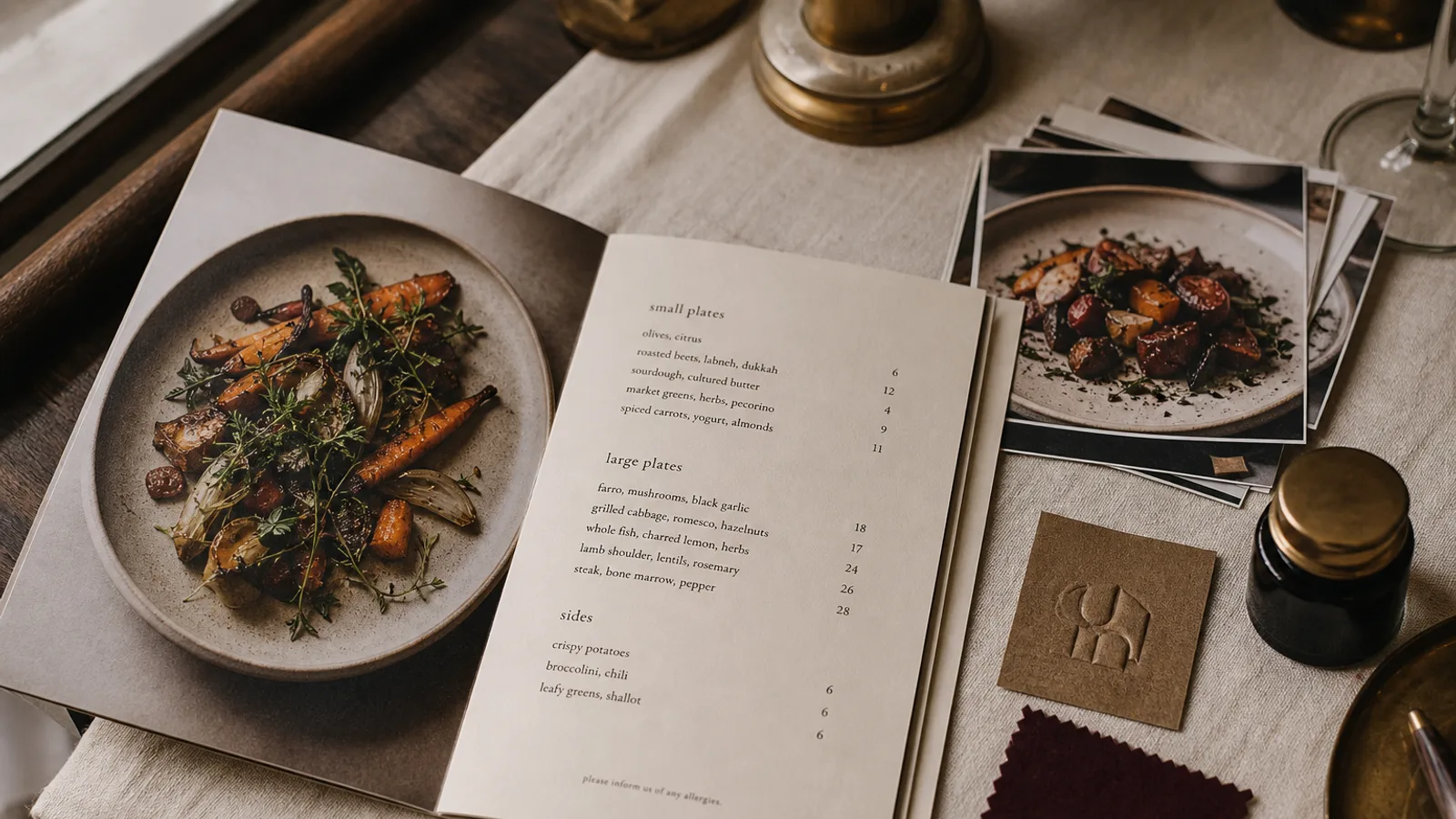
A guest forms an opinion about your restaurant in the ten seconds between sitting down and opening the menu. The sign, the doormat, the server's apron and the card in their hands either tell one story or four different ones. Brand identity is simply the discipline of making them tell one. You do not need an agency or a 40-page brand book to get there; you need four decisions, written down, and one object where they all meet. That object is the menu.
Decision one: a palette of three colours, not eight
Pick a dominant colour, a secondary and an accent. The dominant carries the walls, the cover of the menu and the awning. The secondary is for text and large surfaces where the dominant would be too loud. The accent is for the one thing you want the eye to find: a section title, a house special, the logo mark. Three colours are enough for any restaurant; eight is a sign nobody made a choice.
Write each colour down in every form you will need: a Pantone reference for the sign maker, CMYK values for print, a hex code for the website. Do this once and you never again get a menu that is a slightly different green from the shopfront. If you print in CMYK on coated board, check that your dominant colour actually exists in the Fogra39 gamut; bright oranges, deep purples and some turquoises do not, and will come back duller than the screen.
Decision two: two typefaces with clear jobs
One typeface for headings and the name of the restaurant, one for running text and prices. A serif for the name and a clean sans for the body is the safest pairing for a bistro or trattoria; a single geometric sans in two weights suits a modern café; a high-contrast display serif over a small-caps body suits fine dining. The second typeface must be readable at 9 to 10 pt on a menu under dim light, which rules out most script fonts for anything but the logo.
Buy or license the fonts properly and install them on every computer that touches your materials. Half of all brand drift in restaurants comes from a staff member opening the menu file on a laptop without the font and letting the software substitute it.
Decision three: a tone of voice you can hear
Tone is how the menu describes a dish, how the sign on the door says you are closed, how the Instagram caption sounds. Decide it in three adjectives and one sentence of example. A neighbourhood bistro might choose direct, warm, slightly dry: the description reads « Roast chicken, the good one, with pan juices and frites ». A tasting-menu room might choose spare and precise: « Turbot, brown butter, sorrel ». Neither is better; mixing them on the same card is what looks amateur.
Once you have the three adjectives, read every line of your menu aloud against them. Anything that sounds like a different restaurant gets rewritten.
Decision four: one mark, sized for the smallest use
The logo will appear at 8 mm on a receipt, 30 mm on a menu cover and 800 mm on the facade. Design or choose it for the 8 mm case first; anything with thin lines, small text or a detailed illustration disappears there. Keep a horizontal and a stacked version, plus a single-colour version that works in black and in white. On the menu the mark should sit where the eye enters the page, usually the top of the cover or the top left of a single sheet, and take no more than a tenth of the page height.
Why the menu is the flagship
Of every object carrying your brand, the menu is the only one every guest holds, at reading distance, for several minutes, with money on their mind. The sign is seen for two seconds. The website is seen once. The menu is where the colour, type, tone and mark either resolve into a single impression or fall apart. It is also the cheapest thing to get right: reprinting a run of A4 menus costs a fraction of repainting a facade.
This is why I tell owners to design the menu first and derive everything else from it, rather than the other way round. If the palette and type pairing survive a printed menu at 10 pt under restaurant lighting, they will survive anything.
A one-page brand sheet you can write this week
- Three colours, each with Pantone, CMYK and hex values, and a note on which one goes where.
- Two typefaces, with the weight and size you use for headings, body and prices on the menu.
- Three tone adjectives and two example dish descriptions written in that tone.
- The logo in three versions, with a minimum size in millimetres below which the single-colour version must be used.
- A list of every touchpoint: menu, sign, website, social media, receipts, aprons, packaging, with the owner of each.
Print this sheet and give a copy to whoever makes anything for the restaurant, from the printer to the person who writes the specials on the board. A one-page sheet that is actually used is worth more than a brand book nobody opens.
Keeping it alive without a designer on staff
Brands drift in small steps: a new dish description in a different voice, a seasonal flyer in a fourth colour, a sign maker who picks the nearest vinyl. Review the sheet twice a year against everything printed in the last six months and correct what slipped. In Menu Atelier the palette, typefaces and logo you upload once are applied to every format you generate, so a new A5 bifold for the terrace comes out in the same colours and type as the A4 card inside, and the export carries your exact CMYK values rather than an approximation.