Placing your restaurant logo on a menu: size, position and versions
Where to put a restaurant logo on a menu, how large it should be, which file version to use, and the mistakes that make a mark look like a stamp on 350 g board.
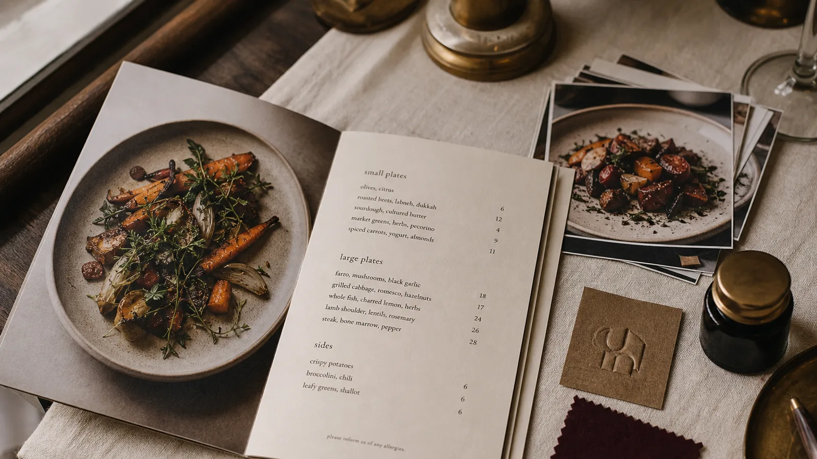
The mark is not the menu. Guests came to read dishes, not to admire a crest. A logo that occupies the top third of an A5, pulled from the website header at 72 dpi, with a white box around it, tells the room you do not have a print file and you are nervous. A mark that sits too small, or disappears into a dark ground, tells them you are shy. There is a useful size, a useful place, and a useful version of the file. Get those three right and the carte looks like it belongs to a house that has already decided who it is.
How large, in millimetres
On an A5 face, 28 to 40 mm on the longest side is enough for most wordmarks. A crest or a pictorial mark can go to 35 mm without becoming the dish. On A4, you can add 8 to 12 mm, not double it. If you need a ruler to find the logo, it is too small; if you need to skip a starter to make room, it is too large.
Clear space around the mark should be at least a quarter of its height on every side, more if the type of the first heading is heavy. Crowding the logo against a rule, a photograph or the word Menu is how amateur files look. The word Menu next to the mark is usually redundant; the object in the guest's hand is already a menu.
On a bifold, the mark belongs once on the front and, if you like, very small on the back with the address and the hours. Repeating it on every inside panel is a brochure habit. Inside, the dishes are the brand.
Where it sits, and why top centre is not a law
Top centre is the default because it is safe. It also wastes a band of useful height on a short A5. Top left, aligned with the left column of dishes, often looks more grown-up and frees the right side for a short season line or nothing. A mark at the foot, small, with the allergen key, works for rooms that want the first line of the page to be a dish. Fine Dining Editorial can live with a footer mark. A trattoria with a painted crest usually wants it at the top; that crest is part of the room.
Do not put the logo in the bleed or 2 mm from the trim. The safe zone is 5 mm inside the trim, 8 to 10 mm if you are cautious. A cut that lands 1 mm in will shave a crest that kisses the edge. I have seen a circular mark lose its ring on one side of a stack; it looks like a printing error even when the file was only optimistic.
On a dark ground, use a reverse version of the mark, not the black file knocked out of a photograph. If you only have a black PNG on white, you do not have a reverse. Commission one, or keep the ground paper-coloured.
The file that is allowed to print
A proper mark is a vector: PDF, AI, or an SVG that has been cleaned. It has no dpi. A PNG is acceptable if it is at least 2000 pixels on the long side, on a transparent ground, without compression halos. A JPEG from the website, 400 pixels wide, with a white rectangle, is not a logo; it is a picture of a logo. Placing it at 35 mm on 350 g board is how you get a stamp.
Ask for versions: full colour, one-colour black, one-colour cream or white for reverse, and a stacked version if the wide wordmark will not fit a narrow panel. Using the wide web header on an A5 and scaling it until the tagline is 5 pt is how taglines die. Cut the tagline on the carte; the dishes will say it better.
- A5: 28–40 mm on the long side, 5 mm minimum from the trim, air on all sides.
- A4: a little larger, not twice; still one appearance on the front.
- File: vector, or PNG 2000 px plus, transparent; never the website JPEG.
- Versions: colour, black, reverse; stacked if the panel is narrow.
Colour, foil and the things that fight the type
A red mark on an ivory sheet is a decision; a red mark plus a red price plus a red rule is a fire. Let the logo own the house colour and keep prices in black or a dark warm grey. On kraft, the brown ground will swallow a mid-red and a pale gold; use black, a dark green, or a foil if you are paying for one pass of metal.
Foil and letterpress on a crest are beautiful on a tasting card and wasted on a lunch formule you will throw away on Thursday. Match the process to the life of the object. Digital one-colour on 350 g is enough for most neighbourhood rooms; the cooking will do the rest.
Photographs behind the mark are almost always a mistake. The crest sits in the pasta, the contrast dies, and you have designed a poster. If you want a photograph, give it its own panel and keep the mark on paper.
Let the mark sit, then get out of the way
Place it once, at a size you can measure, from a file that was drawn for ink, with air around it. Then spend your attention on the type of the dishes. Guests remember the cooking and, if you were quiet enough, they remember that the paper felt like the room.
Menu Atelier asks for a logo at the start, with the dishes and a few brand photos, and lays it into the chosen style (Bistro Classic, Trattoria Rustica, Modern Minimal and the rest) at a size that leaves the columns alone. You see the mark on the object in 3D before you download the 300 dpi PDF with 3 mm bleed. If the file you upload is the website JPEG, the mark will look like a website JPEG; send the vector, or a large transparent PNG, and the carte will look like a house that already knew where its name sits.