Tea menu design: origins, steeping times and calmer typography
How to design a tea menu that sells more than English Breakfast: grouping by family, writing origins and steeping notes, sizing type and pricing pots without clutter.
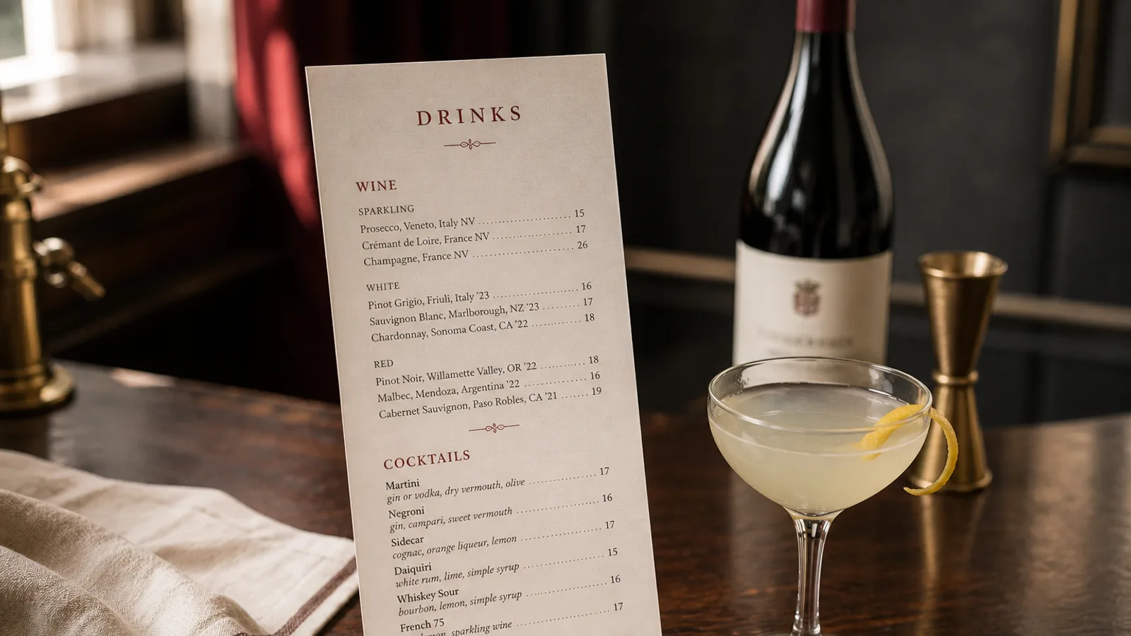
Most restaurants treat tea as a footnote: three bags listed under the coffee, priced at 3 €, never looked at. Yet a well-written tea list has margins that rival wine, takes almost no kitchen time and is exactly what a guest wants after dessert or at 4 pm. This article covers how to organise the list, what to say about each tea, how to lay out steeping information without turning the page into a lab sheet, and which typographic choices make a tea menu feel slow and considered rather than rushed.
Group by family, not by alphabet
Guests do not know tea names; they know preferences. Someone who likes a light, grassy cup will find it faster under a heading that says Green than under a list that starts with Bai Mu Dan and ends with Yunnan Gold. Six families cover almost every list: white, green, oolong, black, dark (pu-erh), and herbal or infusions. Matcha and chai can sit inside green and black, or get their own small block if you sell a lot of them.
Order the families from lightest to darkest, the way a wine list runs from sparkling to red. It gives the page a natural reading direction and mirrors the way a knowledgeable server would talk a guest through the options. Put infusions last: they are the caffeine-free choice and guests who need them will scan to the bottom anyway.
Keep the total between 12 and 20 teas. Beyond that the page becomes a catalogue and the kitchen ends up with tins that go stale. A short list with one excellent example per family sells better than a long one with five mediocre greens.
What to say about each tea
A tea line needs three things: a name a guest can pronounce, an origin, and one sentence of taste. The name is the trade name you actually use, in the original language if that is how it is sold (Sencha, Darjeeling, Tie Guan Yin), with a plain-English descriptor when the name alone tells the guest nothing. Origin is region and country, never just country: Uji rather than Japan, Nilgiri rather than India.
The taste sentence is where most lists fail. Avoid tasting-note pile-ups borrowed from wine. Two or three concrete words work: toasted rice and seaweed; honey, apricot, a little smoke; cut hay and cucumber. Write for someone who has never had the tea, not for a sommelier.
- Name in the language it is sold under, plus a short descriptor when needed
- Region and country of origin, and harvest or grade only if it genuinely differs from what guests expect
- Two or three taste words a first-time drinker can recognise
- Caffeine level as a simple word (none, low, medium, high), not a number in milligrams
Steeping information without the lab sheet
You should show water temperature and steeping time. It signals that you take tea seriously, and it protects the guest from a bitter cup if the pot arrives with a timer or a refill of hot water. The mistake is to format it like a specification: 80 °C / 2:30 / 3 g in bold next to every line makes the page look like an appliance manual.
Set the steeping data in a smaller size than the description, in a lighter weight or a muted colour, on its own line or at the end of the tasting sentence. Use consistent units: degrees Celsius with the degree sign, minutes written as 2–3 min rather than 2:30. If most of a family shares the same parameters, state them once under the family heading (Greens: 75 °C, 2 to 3 minutes) and only note the exceptions. That single decision can remove thirty repeated fragments from the page.
Pots, cups and refills
Say what the guest gets. A pot for one (about 350 ml) and a pot to share (700 ml or more) are two different prices and two different experiences. If you offer a second infusion of the same leaves at no charge, which most good oolongs and pu-erhs reward, put it in a single line at the top of the section: it is a generous gesture and a reason to pick the more expensive tea.
Pricing and the shape of the price column
Tea has a very wide cost range: a supermarket-grade black costs a few cents per pot, a first-flush Darjeeling or a competition-grade gyokuro can cost 1.50 € to 3 € per serving. Your menu should reflect that with a spread of prices, typically 4 € to 12 € for a pot in a European city, so that the middle of the list becomes the natural choice.
Set prices without currency symbols on every line if the heading already says prices are in euros, and without dotted leaders. Leaders pull the eye to the right and encourage price shopping; a price sitting a few spaces after the description, in the same size, is read as information rather than a bill. For two sizes, use two narrow columns with a one-word header (pot, sharing) instead of writing 5 € / 9 € after every tea.
Typography that slows the reader down
Tea is the one section of the menu where the guest has time. The design can be slower: more white space, a serif with generous x-height for the descriptions, a slightly smaller body size than the food menu (9 to 10 pt rather than 10.5 to 11 pt) because line lengths are short and the reader is close to the page. Set the family headings in small caps or a light weight rather than heavy bold; a tea list should not shout.
Line spacing matters more than size here. A leading of 1.4 to 1.5 times the body size, with 4 to 6 mm between teas, gives each entry room to breathe. If you print, a warm uncoated paper (120 to 170 g, natural white) suits tea far better than a bright coated stock, and an A5 single sheet or a narrow DL card is usually enough for a list of 15 teas.
Do not illustrate every tea with an icon of a leaf or a cup. One image, or none, is better than a row of pictograms. If you want visual rhythm, use a fine rule between families and let the type do the work.
A tea list that earns its own page
Separate the tea list from the coffee and soft drinks, either as its own card brought with the dessert menu or as the back page of the drinks menu. Guests who are handed a dedicated list order tea far more often than guests who have to find it under Hot Drinks, and a 7 € pot of oolong ordered by two people at the end of a meal is a better margin than most desserts.
In Menu Atelier, a tea list is a natural fit for the Sushi Zen or Café Chalk styles, and the A5 single-sheet format keeps it compact; you can group teas by family in the editor, set the steeping notes as a lighter secondary line and check the finished card in 3D before downloading print-ready files or ordering it printed on 350 g matte board.