Vintage and retro menu design without the clichés
How to design a vintage or retro menu that feels found rather than faked: choosing one era, period-correct typefaces, paper and ink that age well, and the tropes to avoid.
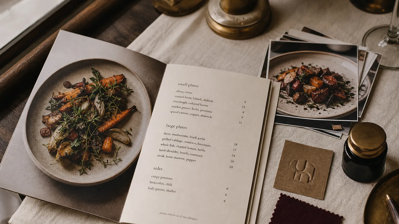
Every second bistro has a « vintage » menu with a distressed texture, a fake coffee stain and a typeface that was designed in 2011 to look like 1920. Guests have seen it a thousand times and it no longer signals anything except a template. Real vintage design works differently: it borrows the discipline of one period, uses materials that actually age, and leaves the theatre out. This is how to do it so the card looks like something you found in a drawer rather than downloaded.
Pick one decade, not « the past »
Vintage is not a style; it is a dozen styles that hate each other. A 1900s French brasserie card is dense, centred, set in a Didone with hairline rules. A 1930s American diner menu is bold, two-colour, with slab serifs and hand-lettered specials. A 1950s Italian trattoria menu is typewritten on thin paper with a printed letterhead. A 1970s steakhouse card is brown, orange and gold with a chunky serif. Mixing them produces the generic « old » look that reads as fake.
Choose the decade that matches your building, your cuisine or your story, then stick to it. If the room was a 1930s pharmacy, the menu can be a 1930s document. If your grandmother's recipes are from the 1960s, look at what a menu from her town actually looked like in 1965. Local archives, flea markets and the online collections of libraries have thousands of real menus to study.
Typefaces: period-correct beats period-flavoured
The most reliable way to look authentic is to use typefaces that existed in your chosen decade, or faithful revivals of them, and to set them the way they were set. For 1900 to 1930, that means a Didone or a Clarendon-style slab for headings, a text roman for descriptions, centred layout, and generous leading. For the 1950s, a grotesque sans in one or two weights, tight lines, prices in a light weight. For the 1970s, a heavy serif with ball terminals, tightly spaced.
- Use at most two typefaces, as printers of the time would have.
- Set body text at 10 to 11 pt; historical menus were often larger than today's because printing was coarser.
- Use old-style numerals for prices where the typeface has them; they were standard until mid-century and immediately read as older.
- Avoid any font with pre-distressed or « eroded » edges. Real wear comes from paper and ink, not from letter outlines.
Paper and ink that age instead of pretending to
A printed texture of old paper on new paper convinces nobody. Buy paper that already has character: a natural or cream uncoated board at 270 to 350 g, a laid or vellum finish, or a slightly toothy recycled stock. These take ink the way old presses did, with a soft edge to the letters, and they yellow and soften gracefully with handling. A card that looks better after three months of service than on day one is the whole point.
Ink colour matters as much as typeface. Pure black on bright white is a modern look. A very dark brown, a deep bottle green or a dark navy in place of black immediately shifts a card back several decades, and a second spot colour in a muted red or ochre completes the effect. Both should be specified in CMYK for standard printing; a true one- or two-colour run on an offset press gives the best result but only pays off above a few thousand copies.
Layout conventions worth borrowing
Historical menus were laid out by hand and the constraints show. Sections are separated by short centred rules or a single fleuron rather than by white space. Dish names and prices are connected by dotted leaders across the column. The restaurant's name sits in a small formal block at the head, often with the address and telephone number, which today reads as charming rather than functional. Prices are aligned in a right-hand column. Copy these conventions faithfully and the card does most of the work.
One modern rule still applies: keep the EU allergen information for the 14 allergens in a clear key, set in the same period typeface at 8 pt, so it belongs to the design rather than being stapled on.
The clichés to leave out
- Fake stains, fold marks and torn edges printed onto the card. Guests know the difference between a printed shadow and a real one.
- Rubber-stamp effects, « est. » badges and crossed cutlery marks; these belong to 2012, not to any real decade.
- Chalkboard-style typography on a printed card; a blackboard should be a blackboard.
- More than two decorative borders or ornaments; period printers were restrained because ornament cost money.
- Sepia-toned photographs of the dishes; old menus rarely had photos at all, and if yours needs one, a black-and-white line drawing is more honest.
Keeping the card legible today
Guests in 2026 are older on average than those in 1930 and eat under dimmer light. A strictly period-accurate 8 pt body will lose you orders. Keep the layout and type choices historical but set the body at 10 pt minimum, allow margins of at least 12 mm, and check contrast: dark brown ink on cream paper needs to be truly dark, around 85 % or more of black equivalent, to be read by candlelight. Authenticity is in the details a guest notices, not the ones that stop them reading.
A card that looks found, not made
The test is simple: would someone who collects old menus believe this one for a second? That happens when you commit to one decade, use its actual typefaces and layout habits, print on paper that ages and resist every effect that imitates age. In Menu Atelier the Bistro Classic and Trattoria Rustica styles are built on period conventions such as centred rules, dotted leaders and old-style numerals rather than on printed textures, and you can preview the result in 3D on a cream uncoated board before deciding whether to export the files or order the print run.