Wine list design: structure, order and how much to say
How to structure a restaurant wine list so guests find a bottle in a minute: order, line length, by-the-glass placement and the words that help without becoming a book.
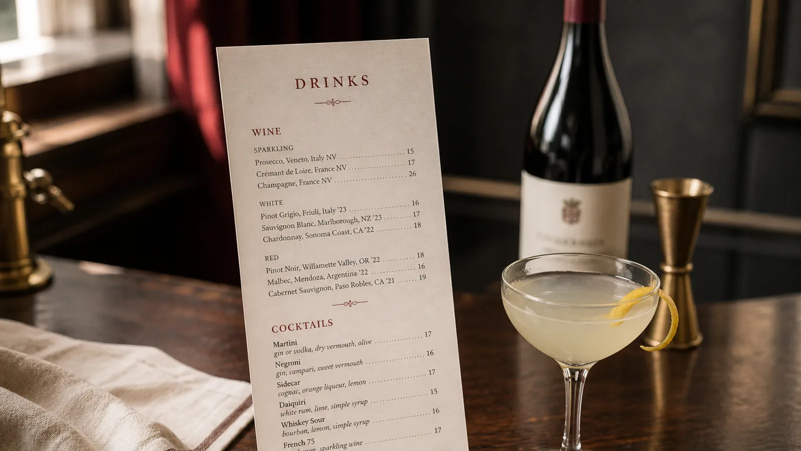
A wine list fails in two opposite ways. It is a novel of soil and amphorae that nobody finishes, or it is a spreadsheet of names and prices that feels like a shop. The useful list sits between: a guest can find a bottle in a minute, a sommelier can still talk, and the page does not go out of date the week a bin sells out. Structure does more of that work than adjectives.
Decide the object before you decide the stories
Count the bottles. Under forty, the list belongs on the back of the food card or on a single A4. Forty to a hundred wants an A4 bifold or a short A5 booklet of eight pages. Past a hundred, print a booklet and keep a one-page "open now" card on the table for glasses and a dozen bottles. A 200-bin list stapled into the dinner menu is how you lose the guest who wanted a glass of white with the starter.
By-the-glass is not a footnote. Eight to fourteen glasses, with the measure in cl, belong on the first face the guest sees, or in a band at the top of page one. People who will not open a bottle still drink; they should not have to hunt. Mark glasses that are also on the bottle list with a small symbol, once, consistently.
Order is a service, not a philosophy
Colour, then weight or region, is the order most rooms can run. Sparkling, white, rosé, red, sweet and fortified. Within a colour, either go light-to-full or group by country. Pick one and print it as a sentence at the top of the first wine page ("Whites run from lean to rich"). Alphabetical by producer looks professional and helps nobody who does not already know the name. Price order trains people to buy the second-cheapest, which you already knew.
Headings should be words guests use: Loire, Sicily, skin-contact, not "vin de soif" unless that is truly how the room talks. A heading every six to twelve bottles is enough. A heading on every bottle is a brochure.
One line, then a second only if it earns its keep
The default line is producer or cuvée, region, vintage, price. "François Chidaine, Les Argiles, Montlouis 2022 42 €." That is a complete wine list line. A second line is allowed when it changes the decision: grape if the name hides it, a style word ("oxidative", "zero added sulphites"), a glass price if the wine is poured. A third line of tasting notes is almost never worth the paper. That is the sommelier's job, or the waiter you trained.
- Old-style numerals for vintages and prices, if the typeface has them; lining figures in a column of years look like a catalogue.
- Bin numbers only if the cellar and the pass use them. Printed for decoration they add noise.
- A sold-out line is worse than a gap. Reprint the page or strike with a pen the same day; a list of ghosts is a list you stopped running.
How much French, Italian or Spanish to print
Print the name as it appears on the label, with the accents. Translate the appellation only when the guest would otherwise miss it ("Txakoli, Basque Country"). Do not translate cuvée names into cute English. Do not set every French wine in a French-looking script; one serif for the whole list is more serious than a costume.
Type, paper and a list that can be updated
11 pt minimum on bottle lines, 9.5 pt if you are truly tight and the room is bright. A serif that holds accents and a grotesque for section words. Avoid a cellar-book script for the body. Paper 350 g for a short card, 170 to 250 g for a booklet that will be reprinted when ten bins move. Soft-touch on the cover of a booklet; the inner pages can be uncoated if you reprint often. Design the list as a template: locked headers, a text frame per colour, so a Tuesday update is typing, not redesigning.
If the list is long, a table of contents on the inner cover ("Sparkling 2, Loire whites 3, Red Burgundy 6") saves more time than any clever illustration. Page numbers in the footer, in 8 pt, not as ornaments.
Sulphites, allergens and the pairing line
A single "contains sulphites" at the foot of each wine face covers Regulation 1169/2011 for the bottles. Food pairings, if you print them, belong on the food menu as a rare, named glass, not as a sentence under every wine. Pairing every bottle to a dish dates the list the week the dish comes off.
Keep the list as short as the cellar is honest
A list is a promise that the bottle is in the building. Cut faster than you add. The guest who finds twelve wines they understand will order; the guest who is offered two hundred they do not will ask for "a glass of red" and you will have printed a book for nothing.
In Menu Atelier you can set a glass band on the first face, a bottle list on the inner pages, and switch the same file from A4 bifold to a short booklet-like A5. Check it in 3D, export a 300 dpi PDF with 3 mm bleed, or order the card printed on 350 g matte board with a scored fold.