Wine pairing suggestions on the food menu: subtle ways that actually sell
Five layouts for putting a wine pairing next to a dish without cluttering the menu, with rules on type size, price display, wording and how many pairings a page can carry.
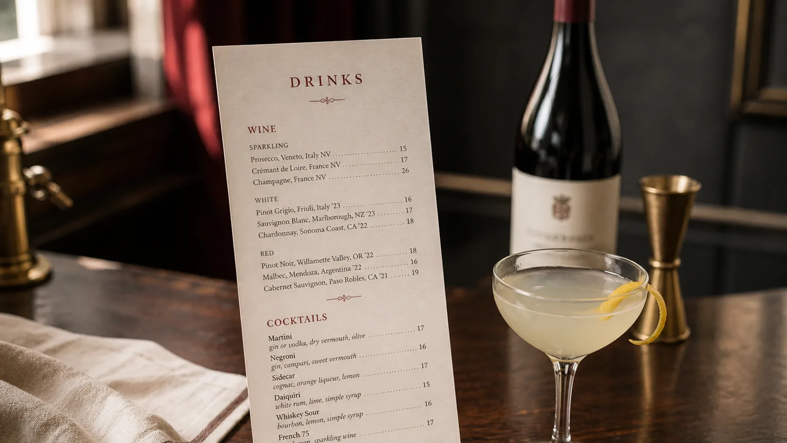
A guest who has just chosen the duck is at the most persuadable moment of the evening: the decision is made, the appetite is up, and a single line saying which glass goes with it can add 9 € to the bill without anyone feeling sold to. Most menus either ignore this moment or wreck it with a bold Sommelier Recommends box that looks like an advert. Here is how to attach a pairing to a dish in a way that reads as hospitality, with the typographic and pricing details that make it work on paper.
Why pairings belong on the food menu, not only on the wine list
The wine list is consulted by one person at the table, usually once, and often before the food is chosen. The food menu is read by everyone, dish by dish. A pairing placed next to the dish reaches the guest who would never open a wine list, and it does the sommelier's job at tables where the server is too busy to do it. In restaurants that add pairings to the food menu, by-the-glass sales tend to rise noticeably while the average wine spend per guest also goes up, because the suggestion is almost always a more interesting glass than the house pour.
The condition is restraint. Pairings on every dish turn the menu into a catalogue; pairings on the wrong dishes (a salad, the children's pasta) read as pushing. Choose the five to eight dishes where a wine genuinely improves the plate, and leave the rest alone.
Five layouts that work
There is no single right way, but there are five patterns that a designer would recognise as clean. Which one suits you depends on how dense your menu already is and how much you want the pairing to be noticed.
- The secondary line: one line under the dish description, in italic or a lighter weight, 1 pt smaller, reading Pairs with Chinon, Domaine X, 9 € per glass. The most common and the most discreet.
- The marginal note: pairing text set in the outer margin next to the dish, in a small size and a muted colour. Elegant on an A4 single sheet with generous margins; impossible on a crowded A5.
- The paired glass symbol: a tiny wine-glass glyph after the dish name, with a key at the foot of the section listing each numbered pairing. Keeps the dish lines clean, but requires the guest to look twice.
- The pairing column: on a two-column layout, the right column carries the suggested glass and price aligned with each dish. Works for tasting and set menus where every course has a pairing.
- The pairing menu: a separate block, usually at the end of the mains, that offers three or four glasses matched to the section (With the fish, With the meat). Less precise, but very easy to update when a wine runs out.
Typographic rules for the pairing line
The pairing must be visibly subordinate to the dish. If the body text is 10.5 pt, set the pairing at 9 or 9.5 pt. Use italic if the descriptions are roman, or a lighter weight of the same family; never bold. A muted colour, such as 70 percent black or the secondary brand colour, separates it from the description without shouting. Leave 1 to 1.5 mm of extra space above the pairing line so it does not read as a continuation of the ingredients.
Keep the wording to one clause: grape or appellation, producer, and price per glass. Avoid tasting notes here; the food description has already done the sensory work. The words Pairs with, Suggested glass or simply the glass name preceded by a small symbol all work; pick one and use it identically across the menu.
Volumes matter more than owners expect. If your glass is 12.5 cl and the guest assumes 15 cl, they will feel short-changed; if you state the volume once at the top of the pairing key (all pairings served in 12.5 cl glasses), you avoid the problem and you do not need to repeat it on each line.
Pricing the pairing glass
The pairing glass should sit slightly above the cheapest glass on the wine list and well below the most expensive: a 9 € to 12 € glass on a menu where mains cost 22 € to 32 € is the comfortable zone. Show the price on the line; hiding it and hoping the guest asks makes many guests skip the offer. Present it the same way as the food prices (no currency symbol if the menu omits it elsewhere, same decimal convention).
Resist the urge to promote the pairing with a special price. A discounted pairing suggests the wine was chosen for margin rather than fit, and it trains guests to wait for deals. If you want to encourage a full pairing across a set menu, price the sequence as a whole (Wine pairing, three glasses, 28 €) rather than discounting individual lines.
Keeping the pairings accurate
The weakness of pairings on a printed food menu is that wines run out faster than dishes change. Two habits solve most of it. First, choose pairings from wines you buy in volume and can reorder, not from the last six bottles of an allocation. Second, write the pairing at appellation level with the producer name in a smaller size or after a comma, so that when the producer changes the line still reads correctly if the server points it out.
Reprint when the list changes rather than crossing out a line by hand. A menu with one struck-through pairing undermines the credibility of all the others. With a compact A4 or A5 reprint at 350 g costing a few euros per copy, updating the printed menu every few weeks is cheaper than the lost glasses of a stale one.
A line that does the sommelier's job
Pick your five to eight dishes, write one quiet line under each, size it a point smaller, price it honestly and check that the glass is really in the cellar. It is the least intrusive upsell in the trade and one of the most reliable, because it appears exactly when the guest wants help and says nothing more than a good server would.
In Menu Atelier, a pairing sits naturally as the secondary line of a dish, inherits the lighter secondary style of the chosen design and reflows automatically when you switch from A4 single sheet to A5 bifold; you can check that the added lines still fit in 3D before exporting or ordering the print.